
Canada’s Oceans Now: Atlantic Ecosystems, 2018
Table of Contents
- Foreword
- Introduction
- The Ocean Environment
- Life in the Atlantic
- Phytoplankton
- Zooplankton
- Crucial links between climate and marine productivity
- Intertidal Flats
- Eelgrass beds
- Eelgrass: An Ecologically Significant Species
- Kelp beds
- Corals and sponges
- Sand dollar beds
- Fish and invertebrate communities
- It’s complicated: seals and Atlantic cod
- Novel warm-water species
- Marine mammals
- Sea turtles
- Seabirds
- Aquatic invasive species
- Everything is connected
Foreword
Canada’s Oceans Now reports are annual summaries of the current status and trends in Canada’s oceans. These reports for Canadians are part of the Government of Canada’s commitment to inform its citizens on the current state and potential future state of Canada’s oceans.
Canada’s Oceans Now: Atlantic Ecosystems provides the current status and trends in Atlantic Canada’s marine ecosystems up to the end of 2017. This report is based on the scientific synthesis reportFootnote 1 which was presented at a science meeting in December 2017. The synthesis report includes summaries of the available peer-reviewed literature and data on aspects of the physical and chemical oceanography, biological oceanography, habitats, fish and invertebrate communities, marine mammals, sea turtles, and seabirds. Fisheries and Oceans Canada (DFO) scientists and colleagues from Environment and Climate Change Canada (ECCC) contributed peer-reviewed and published data from monitoring and research programs for this report. This information will be updated in future reports to create an ongoing picture of the status and trends of Atlantic Canada’s marine ecosystems.
Introduction
Understanding the health of the marine environment is vitally important to an ocean nation like Canada. The surrounding Atlantic, Arctic, and Pacific oceans support all Canadians. Every Canadian shares a deep connection with these dynamic marine ecosystems. Our oceans support everyday recreation and tourism, cultural and spiritual pursuits, and the health of Canadians. They are an important source for food and natural resources across the country. On a larger scale, all life on our planet is affected by the oceans’ role in regulating global climate, nutrient cycling, and biodiversity.
Marine ecosystems include the physical and chemical environment along with a vast array of living organisms, from tiny plankton to giant whales. These ecosystems are varied, complex, and naturally dynamic. But the added impacts of human activities and climate change are causing changes to occur. These changes can have serious impacts on the health of marine ecosystems.
Climate change is a key driver of the changes observed within the Atlantic Ocean environment. Rising atmospheric temperatures are having effects that include warmer sea-surface temperatures, less sea ice cover, rising sea levels, and changing ocean currents. Increased absorption of carbon dioxide by sea-surface water is leading to ocean acidification. Understanding the interconnections of these diverse components can be challenging. However, this knowledge is more important than ever.
As an ocean nation, Canada has a responsibility to study and protect these marine ecosystems. Government scientists regularly monitor and conduct research on the oceans to track the status and trends occurring over time.
This report looks at what scientists know about the Atlantic Ocean environment. From sea-surface temperature to fish population numbers, it summarizes the overall health and state of Canada’s Atlantic Ocean.
Atlantic Canada’s three ocean zones
The Canadian Atlantic Ocean is divided into three bioregions: the Newfoundland and Labrador Shelves (NL), the Scotian Shelf (SS), and the Gulf of St. Lawrence (GSL) (Figure 1). Each bioregion is based on geographic differences in ocean conditions and depth and has distinct characteristics. However, the boundaries between them are transition zones, not abrupt borders.
The Canadian Atlantic Ocean is heavily influenced by seasonal changes in currents, water temperature, sea ice, and freshwater runoff. Seasonal changes in sea ice, particularly on the Newfoundland and Labrador Shelves and the Gulf of St. Lawrence, influence freshwater input and the timing of phytoplankton blooms. The Labrador Current brings cool Arctic water along the Newfoundland and Labrador Shelves (Figure 2). This is the southernmost penetration of Arctic waters in the Northern Hemisphere. The southern part of the Scotian Shelf is warmed by Gulf Stream water from the south. The mixing of these two flows creates a key area of high productivity along the tail of the Grand Banks of Newfoundland that supports regional ecosystems. The Gulf of St. Lawrence has significant freshwater input from the St. Lawrence River that mixes with waters from the Atlantic: Labrador Shelf waters through the Strait of Belle Isle and a mixture of cold Labrador Current water and warm Gulf Stream water from the Cabot Strait.
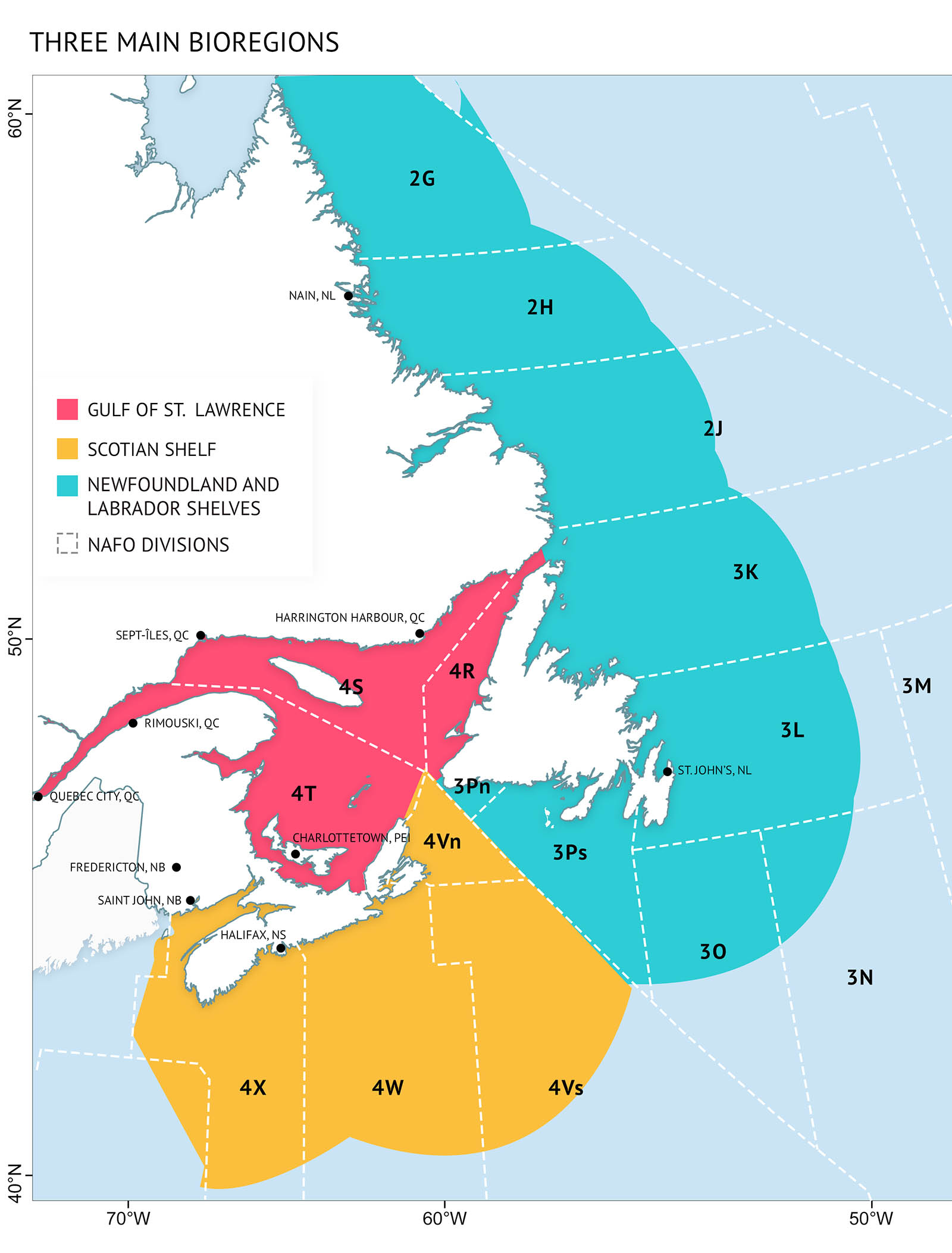
Figure 1: Three Bioregions of Atlantic Canada – Bioregion locations are based on ocean conditions and depth. Northwest Atlantic Fisheries Organization (NAFO) sub-divisions are boundaries used for science and management of various marine resources and are used throughout the report.

Figure 2: Currents of the Canadian Atlantic – Two main current systems influence the Canadian Atlantic – the cold Labrador Current from the north (darker blue), and the warm Gulf Stream from the south (dark red).
The Ocean Environment
Changes in the physical environment have important impacts on biological systems at different scales. For example, warming temperatures caused by climate change can have impacts on individual organisms, such as changes in species growth rates or at larger scales such as changes in food webs.
Oceanographers have measured ocean conditions off the Atlantic coast for decades. This wealth of data is being used to understand the links between the environment and ecosystems. It is also used to assess the impacts of human activities. Two major Fisheries and Oceans Canada programs collect data on ocean conditions. The Atlantic Zone Monitoring Program (AZMP) and the Atlantic Zone Offshore Monitoring Program (AZOMP) study the physical, chemical, and biological properties on the continental shelves and slopes off Canada’s east coast.
During monitoring and research surveys, sampling devices known as rosettes are deployed down through the water column. The sensors they carry can measure physical and chemical variables such as temperature, dissolved oxygen and acidity. They also carry bottles to collect water samples at different depths. These samples can be analyzed onboard the ship or onshore in a lab. This information, combined with other sources of data like satellite imaging, gives a bigger picture of the health of the ocean. Environmental conditions are usually reported in a way that shows how they differ from long-term averages. These differences are known as anomalies. For temperature from remote sensing, these anomalies are generally calculated in relation to the average temperature over the period of 1985–2010 and 1981-2010 for other oceanographic parameters.
Temperature
The waters of the North Atlantic are temperate, as they get both cold and warm depending on the season. Surface water temperatures vary with air temperature. Deeper waters do not show much seasonal change but are instead influenced by currents. An important interaction is the mixing of cooler, fresher water from the Labrador Current and the warmer, saltier waters of the Gulf Stream.
Rising air temperatures driven by climate change and changes in currents are leading to warmer temperatures at both the sea-surface and deep waters (Figure 3, Figure 4). Temperature is an important environmental factor. It influences everything from physical processes (such as sea ice formation and mixing of the water column) to the condition and behaviour of the species that live there.
Scientists measure water temperatures through the water column using automated sensors and direct measurements on research surveys. They also interpret satellite information. Sea-surface temperature from remote sensing is reported for ice-free periods of the year. These periods vary annually and regionally (from the north to south).
Status and trends
- Sea-surface temperature during ice-free months is related to air temperature. The rise in air temperature seen since the 1870s is about 1℃ per century. As a result, sea surface waters are warming in Atlantic Canada.
- For the region, two of the five warmest years since satellite records began were recorded in 2012 (warmest) and 2014 (4th).
- In 2012, the Scotian Shelf, St. Pierre Bank, and the Grand Bank had their warmest sea-surface temperatures since 1985, when satellite records first became available. The St. Lawrence Estuary had its warmest sea-surface temperatures in 2016.
- The influence of the Gulf Stream relative to the Labrador Current is increasing. This is leading to record high deep-water temperatures on the Scotian Shelf and in the deep channels of the Gulf of St. Lawrence. A 100-year record high was observed in the northern Gulf of St. Lawrence in the 2012-2016 period.
- Between 2012-2016, the Newfoundland and Labrador Shelves had overall above-average bottom temperatures with some near-average temperatures in the latter half of the period. A 33-year record high was also observed off southern Newfoundland.

Figure 3: Index of sea surface temperature for the Atlantic bioregions measured during ice-free times of the year. These values are relative to the 1985-2010 average. The black trend line represents the combined anomalies for all areas (eGoM: eastern Gulf of Maine; BoF: Bay of Fundy; see Figure 1 for NAFO Divisions). Above average trends are warm conditions.

Figure 4: Index of ocean bottom temperatures for the Atlantic bioregions relative to the long-term average (1981-2010). The black trend line represents the combined anomalies for all areas (nGSL: northern Gulf of St. Lawrence; see Figure 1 for NAFO Divisions). Above average trends are warm conditions. Shifts in currents have brought record highs since 2012.
Sea Ice and cold intermediate layer
Seasonal changes in sea ice and the layers in the water column play important roles in the way North Atlantic ecosystems function. An important feature in this region is the cold intermediate layer (CIL). The CIL forms in some areas when the winter cold mixed layer is trapped by spring surface warming, along with freshwater from sea ice melt and runoff from land, forming a less dense layer at the top of the water column [See: Stratification and the cold intermediate layer]. In some areas, the layering may persist for most of the year. Since sea ice cover and the CIL both form in winter, they often relate to each other as well as with winter air temperature. The data are therefore combined as one index (Figure 5). The CIL influences mixing within the water column. This affects how nutrients are distributed, which has an impact on the productivity of ecosystems.
Seasonal changes in sea ice, particularly on the Newfoundland and Labrador Shelves and the Gulf of St. Lawrence, influence freshwater input and the timing of phytoplankton blooms (See Phytoplankton Section). Sea ice also provides habitat for organisms that live under and on the ice.
Sea ice cover is monitored by the Canadian Ice Service (ECCC) using aerial surveys and satellite imaging, providing important factors such as the maximum extent of sea ice into southern areas and its timing. Estimates of the coverage, thickness, and volume of ice are also made.
Status and trends
- Climate change is leading to less sea ice cover in Atlantic marine ecosystems. Warmer winters since the late 1800s have led to generally longer periods without ice and lower ice volume.
- During the past decade, ice volumes on the Newfoundland and Labrador Shelves, the Gulf of St. Lawrence, and the Scotian Shelf have been lower than average in most years. They reached a record low in the Gulf of St. Lawrence in 2010 and on the Newfoundland and Labrador Shelves in 2011.
- For the period between 2010-2016, 3 years were among the 7 lowest average sea ice volumes ever observed on the Newfoundland and Labrador Shelves. In the Gulf of St. Lawrence, 5 years were among the 7 lowest average sea ice volumes ever observed.
- Warmer winters are leading to weaker CILs. In 2012, there were record lows for CIL volumes in both the Gulf of St. Lawrence and Scotian Shelf, representing record warm conditions.

Figure 5: Index of cold intermediate layer (CIL) and sea ice volume for the Atlantic bioregions relative to the long-term average (1981-2010). The black trend line represents the combined anomalies for all areas (sGSL: southern Gulf of St. Lawrence; see Figure 1 for NAFO Divisions). Above average trends are seen when warming conditions lead to less sea ice and a weak CIL.
Stratification and the cold intermediate layer
The ocean becomes stratified because layers of water with different densities make mixing of the water column more difficult (Figure 6). During fall and winter, cooling and wind cause mixing and homogenization of the upper layers of the ocean. In the spring and summer, surface waters become less dense because of warming and increased freshwater from melting sea ice and runoff from land. This less dense water does not easily mix into the denser, cooler, deep water leading to stratification. A cold intermediate layer (CIL) forms as cold, winter water is trapped under this less dense surface layer. In some shallower areas, the CIL may extend all the way to the bottom, but in others a third deep, denser layer remains. The water temperature used to define the CIL is different between the bioregions. On the Newfoundland and Labrador Shelf it is <0℃, in the Gulf of St. Lawrence it is <1℃, and on the Scotian Shelf it is <4℃.

Figure 6 Stratification of the ocean is influenced by temperature, the input of freshwater from land and sea ice melt, and energy for mixing from wind and currents which change seasonally.
Oxygen
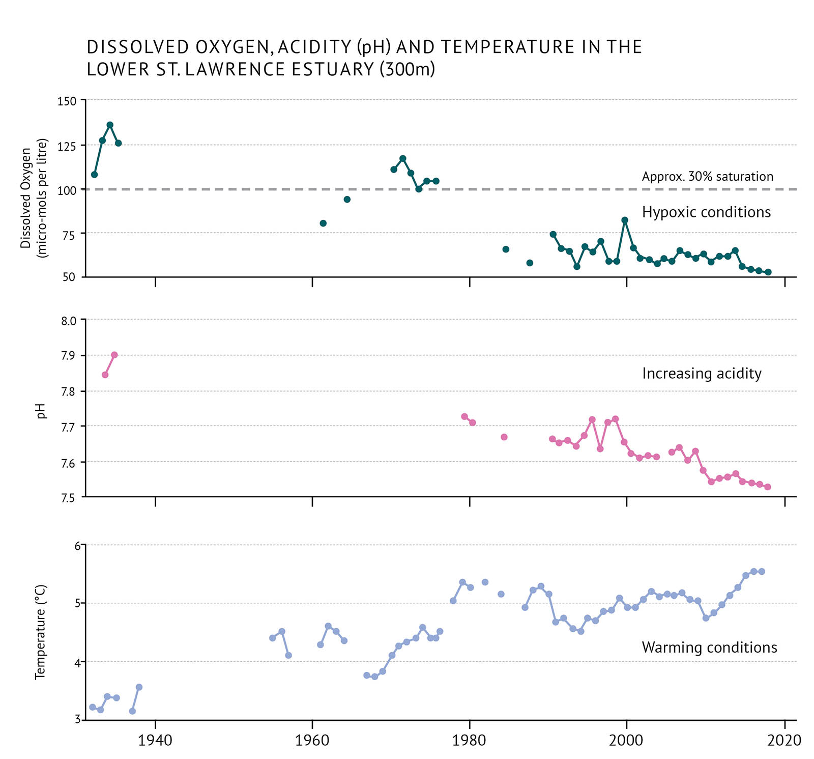
Figure 7: Average dissolved oxygen, pH (acidity) and temperature measurements for the lower St. Lawrence Estuary at approximately 300 metres. Values of dissolved oxygen below 30% saturation are considered extremely hypoxic.
The amount of dissolved oxygen in seawater is important for the health of marine organisms. In deep water, mixing from the surface waters can replace oxygen. When there is little mixing, dissolved oxygen can be depleted by the respiration of organisms and the breakdown of organic matter. When oxygen levels are too low, the condition is called hypoxia. When oxygen levels fall below 30 percent of the maximum they can hold, it is considered severely hypoxic. This can have serious effects on ecosystems. Changes in climate can contribute to hypoxia occurring. So too can the input of organic matter from algal blooms caused by high levels of nutrients. This has been a problem in the Gulf of St. Lawrence (Figure 7).
Hypoxia can dramatically affect marine life and ecosystems. It can slow growth and reduce reproductive success among ocean species. It can also impact the way species are distributed, as most species leave an area before hypoxia can kill them. With severe hypoxia, species that cannot move fast enough out of the affected area can suffer high mortality rates.
Dissolved oxygen is regularly measured throughout the water column as part of oceanographic surveys done within the region.
Status and trends
- The greater influence of water from the Gulf Stream is contributing to hypoxic conditions in the deep St. Lawrence Estuary. While the deep waters of the St. Lawrence Estuary were briefly hypoxic in the early 1960s, they have been consistently hypoxic since 1984.
- Dissolved oxygen in the Gulf of St. Lawrence decreased to its lowest annual average in 2016. This corresponds to an 18% saturation level.
Acidification
Ocean acidity is increasing as the ocean absorbs ever-greater amounts of atmospheric carbon dioxide from human activities. Carbon dioxide dissolves in the surface ocean water to form carbonic acid. An increase in acidity makes the water more corrosive to calcium carbonate, the main element of the skeletons and shells of many organisms including plankton, molluscs, crustaceans, and corals. Increases in acidity can also cause increased physiological stress for these organisms. These changes can have implications for food webs and ecosystems as a whole.
Acidity has been measured consistently since the 1990s. Intermittent measurements extend back to the 1930s. Acidity is measured on the pH scale [See pH]. Lower pH indicates more acidic conditions and higher pH indicates less acidic conditions (Figure 7).
Status and trends
- In general, acidity has increased at a higher rate in Canadian Atlantic waters than in other parts of the world.
- The acidity of ocean waters adjacent to the Newfoundland Shelf (Labrador Sea) has been increasing steadily since consistent measurements started in 1993. This has been measured as a decrease in pH at a rate of about 0.02 pH units per decade.
- The acidity of the waters off the Scotian Shelf and in the Gulf of St. Lawrence has also been increasing. On the Scotian Shelf, pH has decreased at a rate of about 0.03 pH units per decade. The Gulf of St. Lawrence has experienced a decrease in pH of about 0.04 units per decade since 1934.
Runoff and stratification
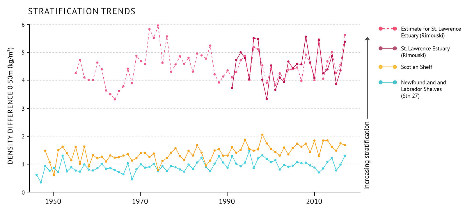
Figure 8: Water column stratification measured as the difference between the density of water at the surface and water at 50m depth. The estimate for the St. Lawrence estuary is based on fresh water runoff. A large difference in density, such as shown here in the St. Lawrence Estuary, means more stratification and potentially inhibited mixing. On the Scotian Shelf and Newfoundland and Labrador Shelves the difference is lower. There is lower stratification in these areas.
The circulation and mixing of the ocean can be impacted by runoff from the land especially in areas that receive large amounts of runoff, like the St. Lawrence Estuary. Layering called stratification can form in the water column because waters with different densities don’t mix very easily [See: Stratification and the cold intermediate layer]. Freshwater runoff from the land can increase stratification, since fresher water is less dense than saltier water. Along with tides and wind, runoff drives the circulation within the St. Lawrence Estuary and, to a lesser extent, in the whole Gulf of St. Lawrence.
Ocean stratification can affect the way nutrients are mixed into surface waters. A change in nutrient mixing influences phytoplankton growth and blooms. This, in turn, impacts ecosystem productivity.
The amount of stratification in the water column is measured by looking at the difference in density between water at the surface and water at a depth of 50 metres. Long-term trends are reported for three locations: Station 27 (a site off St. John’s, Newfoundland and Labrador), Rimouski Station in the St. Lawrence Estuary, and the Scotian Shelf. Year to year, stratification at the Rimouski Station is strongly related to the seasonal average runoff of the St. Lawrence River (Figure 8).
Status and trends
- Freshwater runoff into the St. Lawrence Estuary decreased between the early 1970s and 2001. This was followed by an upwards trend between 2001 and 2011, and has been fairly stable to 2016. Stratification in the St. Lawrence Estuary is tied to seasonal freshwater runoff and has followed a similar pattern.
- At Station 27, stratification increased from below-average values in the mid-1960s to a record high in 1995. Since then, it has been following a mostly decreasing trend.
- Since 1948, there has been an increase in the average stratification on the Scotian Shelf. This change is due mainly to a decrease in the surface density (76% of the total density change). This decrease is caused equally by warming and the addition of freshwater to the surface water.
Sea level

Figure 9: Sea level difference for locations across the Atlantic bioregions between 1890 and 2011. The values are relative to the average for 1981-2010 in each area (See Figure 1 for locations.). Glacial melt along with ocean warming is causing sea level to rise in many areas along the Atlantic coast at a rate of 2 to 4 mm/year while falling in others.
As the world’s oceans become warmer and glaciers melt due to increasing global temperatures, the volume of seawater rises. In some areas, this is offset to some extent because the land is still rising after the removal of the weight of ice following the end of the last ice age. This means that some areas will experience rising sea levels while others will experience falling sea levels (Figure 9).
Sea level rise can degrade habitat or lead to its loss in coastal areas. It also makes coastal areas more vulnerable to storm surges. This can impact the distribution of important habitat-forming species such as eelgrass and kelp.
Changes in sea level are measured using tide gauges and satellite measurements. In some areas, data are available from the late 1800s. For others, data starts in the mid-1900s. The trends are reported in relation to the average sea level measurements for 1981–2010 in each area.
Status and trends
- To the south, sea level is rising 2 to 4 mm per year (for example, Halifax, Saint John, Charlottetown, St. John’s).
- In the north, sea level is falling 2 mm per year (for example, Nain).
- The direction of sea level change along the northern Gulf of St. Lawrence coast varies. It is falling in Harrington Harbour and rising at Sept-Îles. In the southern St. Lawrence Estuary there is very little evidence of changing sea level at this time.
Nutrients
Like plants on land, phytoplankton require light and nutrients to grow. The most important nutrients include nitrogen (nitrates, nitrites, and ammonium), phosphorous (phosphate), and silica (silicate). Nitrogen is usually the limiting nutrient for the growth of phytoplankton in the ocean. This means that it is usually present in lower concentrations in surface water than other nutrients. As a result, nitrogen cycling within the water column is very important.
The size of the spring phytoplankton bloom is partly dependent on the amount of nutrients that are mixed into surface waters during the winter. In fall, a secondary bloom that is less intense than the spring bloom can occur. This happens when nutrients are mixed from deep water into surface waters that were depleted during the summer. Since phytoplankton form the base of many marine food webs, the size of the spring bloom is linked to the overall productivity of these ecosystems.
Nutrients are regularly measured through the water column as part of oceanographic surveys within the Atlantic region. Nitrogen is reported as the “deep water nitrate inventory” (Figure 10). This represents nitrate concentrations present in deeper water, which at some time may be mixed through the water column to become available to phytoplankton.
Status and trends
- Changes in nitrate were not uniform in all parts of the Atlantic. Over the last five years, conditions well below the long-term average were often observed in many parts of the Northwest Atlantic.
- The greatest declines, which persisted until 2014–2015, occurred on the Newfoundland Shelf.
- Conditions in the Gulf of St. Lawrence and Scotian Shelf had more moderate shifts over time. However, most recently nutrient levels in the Gulf and on the Scotian Shelf are near and below average, respectively.
- Nitrate inventories in deep water are highly variable. However, they have been largely at average levels from 2012 to 2016 after a general declining trend from 1999 to 2010.

Figure 10: Index of nitrate concentrations measured in deep waters between 50-150m depth. These values are relative to the long-term average (1999-2010). The black trend line represents the combined anomalies for all areas (See Figure 1 for NAFO Divisions). Above average trends are higher concentrations. The levels of nitrate impact the spring bloom which is linked to the productivity of other species.
Life in the Atlantic
Canada’s Atlantic waters are one of the most productive marine environments in the world. Marine communities consist of a variety of organisms from microscopic phytoplankton, which form the base for marine food webs, to fish and invertebrate species including important commercial species (e.g. Atlantic cod, snow crab, American lobster), and some of the largest mammals found on Earth such as the blue whale. These organisms live in a wide variety of habitats. In coastal areas, structured habitats such as eelgrass beds and kelp forests, all provide important feeding resources for other organisms, shelter from predators, and nursery areas for young. Cold-water corals and sponges in the deep offshore provide more complex habitat on the sea floor, which many species depend on for shelter and food. The Northwest Atlantic is also an important feeding area for many migratory species, including turtles, whales, and seabirds.
Scientific observations have revealed that these ecosystems are experiencing both physical and biological changes at different rates and scales across the Atlantic region. The distribution of species is shifting and communities are changing. All species in this marine ecosystem have experienced changes, from phytoplankton and other marine plants to invertebrate and fish communities, to marine mammals and seabirds. Changes are also occurring in habitats experiencing stress. This places additional negative impacts on species. Climate change is one of the key drivers of these changes. Other human activities that have an impact include fishing, coastal development, and resource exploitation.
Phytoplankton

Figure 11: Index of Chlorophyll a concentrations relative to the long-term average (1999-2010). These values are used to indicate the biomass of phytoplankton. The black trend line represents the combined anomalies for all areas (See Figure 1 for NAFO Divisions). Above average values represent higher concentrations. In most of the region, phytoplankton biomasses have been well below average since 2015.
Phytoplankton are microscopic plants that produce oxygen and organic matter from sunlight, carbon dioxide, and inorganic nutrients, like plants on land. Phytoplankton increase in abundance (or bloom) in the spring, and to a lesser extent, in the fall. Blooms can occur when the water column is stable, so phytoplankton can remain near the surface where light levels are high, and nutrients are available.
Phytoplankton support many marine food webs as the key food source for zooplankton, that are in turn food for many fish and marine mammals. Phytoplankton abundance is an indicator of how productive a system is. Changes in the timing of the spring bloom can have consequences for many other organisms in the ecosystem.
Through direct sampling and satellite imagery, scientists measure “chlorophyll a” in the surface ocean. Chlorophyll a is the main pigment used in photosynthesis. These measurements are used to represent the biomass and productivity of phytoplankton in the ocean. The more chlorophyll a that is detected, the more phytoplankton cells are assumed to be in the water (Figure 11). The magnitude, peak time, and duration of the blooms are assessed by looking at changes in the chlorophyll a concentrations (Figure 12a, Figure 12b, Figure 12c). This provides information on how the entire system changes from year to year. [See: Crucial links between climate and marine productivity].
Status and trends
- Declining nutrient and chlorophyll levels may indicate that Atlantic ecosystems have a lower production potential than in the previous decade.
- The general trend has seen a gradual decline in overall phytoplankton abundance in the Atlantic. Since 2015, most parts of the region had phytoplankton levels well below average.
- Generally, patterns of variation in phytoplankton abundance reflect those reported for nutrients. However, they lag behind nutrient variability by about one year.
- The patterns of variation in the features of the spring phytoplankton bloom have been relatively consistent across the Northwest Atlantic.
- The magnitude of the spring bloom increased from 1999 to 2011, when it reached its highest peak. It then declined to an average state by 2016. The extent to which the spring bloom amplitude varied followed a similar pattern.
- The day of year at which the spring bloom starts has been variable from year to year. The shift has been from either generally early or late in relation to average over periods of 3 to 5 years.
- Conditions in the 2010–2012 period were very warm and spring phytoplankton blooms were early. However, gradual cooling since this time seems to have resulted in a general delay in the start of the bloom from 2013-2016.
- Duration of the spring bloom varies greatly among the different parts of the Northwest Atlantic. However, there was a general decline in the overall duration of the bloom from 1999 to 2011, after which conditions returned to near average from 2012-15 followed by a record duration in 2016.
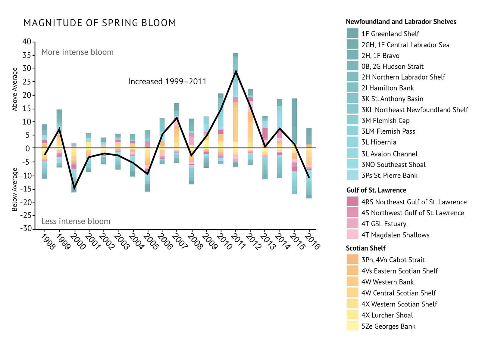
Figure 12: Observations of the spring phytoplankton bloom including indexes of a) magnitude, b) peak time, and c) duration. All are relative to the long-term average (1998 to 2010). The black trend lines represent the combined anomalies for all areas (See Figure 1 for NAFO Divisions).

Figure 12: Observations of the spring phytoplankton bloom including indexes of a) magnitude, b) peak time, and c) duration. All are relative to the long-term average (1998 to 2010). The black trend lines represent the combined anomalies for all areas (See Figure 1 for NAFO Divisions).

Figure 12: Observations of the spring phytoplankton bloom including indexes of a) magnitude, b) peak time, and c) duration. All are relative to the long-term average (1998 to 2010). The black trend lines represent the combined anomalies for all areas (See Figure 1 for NAFO Divisions).
Zooplankton
Zooplankton are small animals that drift in the water column, feeding on phytoplankton, bacteria, and fungi. They range in size from 0.2 mm to 20 mm. Zooplankton community structure is strongly influenced by water depth, temperature, and season. Communities differ substantially among the three Atlantic bioregions. Copepods are the most abundant zooplankton species in the western North Atlantic. One of the largest, most widespread, abundant, and energy-rich zooplankton species is the copepod Calanus finmarchicus. Smaller copepods known as Pseudocalanus spp. are less energy-rich, but they are studied as a way of representing all of the smaller species in the community.
Zooplankton are a critical link between phytoplankton and larger marine animals. Because C. finmarchicus is both abundant and nutritious, changes in its abundance have important consequences for animals that rely on it as a primary food source.
On research surveys, zooplankton are collected by net tows. The tows help determine the abundance and species types of zooplankton. Abundances are reported for total zooplankton, C. finmarchicus, Pseudocalanus spp., and non-copepod species. Monitoring these four levels has been found to provide a good indication of the health of zooplankton communities across the Atlantic bioregions (Figure 13a, Figure 13b, Figure 13c, Figure 13d).
Status and trends
- Shifts in zooplankton communities indicate important changes at the base of many marine food webs. This may have consequences for the upper levels of these food webs.
- A shift has been observed in the zooplankton community structure. The large energy-rich copepod C. finmarchicus is in lower abundance. There is a higher abundance of small and warm-water copepods, as well as non-copepods.
- C. finmarchicus has been declining since 2009, with the greatest declines occurring on the Scotian Shelf.
- The smaller copepods, Pseudocalanus spp., have increased in abundance, during the last decade, particularly in the Gulf of St. Lawrence and the Newfoundland Shelf. They reached record levels throughout much of the Atlantic zone.
- Total copepod abundance and non-copepod abundance have also increased to higher than average levels since 2014. The highest values were seen in the Gulf of St. Lawrence and on the Newfoundland and Labrador Shelves. Non-copepod zooplankton had record high numbers in all three bioregions since 2014.

Figure 13: Observations of zooplankton abundances including indexes for a) Calanus finmarchicus, b) Pseudocalanus spp., c) total copepod species, and d) non-copepod species. All are relative to the long-term average (1999-2010). The black trend lines represent the combined anomalies for all areas (See Figure 1 for NAFO Divisions).
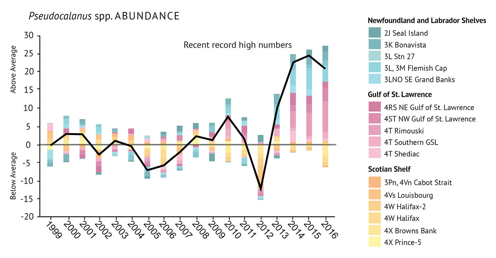
Figure 13: Observations of zooplankton abundances including indexes for a) Calanus finmarchicus, b) Pseudocalanus spp., c) total copepod species, and d) non-copepod species. All are relative to the long-term average (1999-2010). The black trend lines represent the combined anomalies for all areas (See Figure 1 for NAFO Divisions).

Figure 13: Observations of zooplankton abundances including indexes for a) Calanus finmarchicus, b) Pseudocalanus spp., c) total copepod species, and d) non-copepod species. All are relative to the long-term average (1999-2010). The black trend lines represent the combined anomalies for all areas (See Figure 1 for NAFO Divisions).

Figure 13: Observations of zooplankton abundances including indexes for a) Calanus finmarchicus, b) Pseudocalanus spp., c) total copepod species, and d) non-copepod species. All are relative to the long-term average (1999-2010). The black trend lines represent the combined anomalies for all areas (See Figure 1 for NAFO Divisions).
Crucial links between climate and marine productivity
Timing is important when it comes to the relationship between phytoplankton, zooplankton, and the forage fish that feed on them. That timing depends on winter and spring climatic conditions.
Small pelagic (open water dwelling) fish like Atlantic herring and capelin are major prey for larger marine predators like Atlantic cod, Greenland Halibut, seabirds, and marine mammals. These prey fish are also called forage fish.
Recent studies on the Newfoundland and Labrador Shelves have provided insight into how climate affects the capelin population. A key factor is the timing of melting sea ice in spring that generates ocean conditions that are favourable to the spring bloom of phytoplankton. If blooms occur too early, due to early ice retreat, zooplankton may miss the maximum peak of phytoplankton production. This creates a “mismatch” in energy flow, and reduces zooplankton productivity. The result is lower forage fish production. Capelin and herring production are linked directly with the abundance of their zooplankton prey. Capelin growth and spawning may be directly impacted by poor zooplankton production.
In turn, capelin availability has been shown to be an important driver of the abundance of the northern Atlantic cod stock and reproductive rates in harp seals.
These “bottom up” processes connect spring phytoplankton blooms to zooplankton abundance and the performance of forage fish which impacts organisms higher in the food web (Figure 14).

Figure 14: Spring ice retreat is important for creating conditions favourable for the spring phytoplankton bloom. When the timing of spring ice retreat causes a “mismatch” between spring bloom and peak zooplankton production, this leads to low productivity of zooplankton and in capelin which feed on them. This impacts the availability of food for species higher up the food web.
Intertidal Flats
Intertidal flats are dynamic environments that are submerged by seawater during high tide and exposed to air during low tide. The various sizes of soft-sediment types (categorized by grain size) that form these intertidal flats provide habitat for a diversity of marine organisms living above and below the surface. These include many species of worms, molluscs, crustaceans, shorebirds, and fishes.
Intertidal flats are ecologically and economically important habitats. This habitat supports major food sources for resident and migratory shorebirds. They also support large densities of clams and worms that are harvested commercially and recreationally. Of all the intertidal flats in Atlantic Canada, some of the most important are the mudflats of the Bay of Fundy. These mudflats support high densities of infaunal animals (animals living within sediments) that support the migration of millions of shorebirds each year. Extreme environmental conditions may impact marine organisms that inhabit intertidal flats. These include warming temperatures, ocean acidification, and eutrophication.
Both the abundance of organisms and the organic content of sediments need to be studied at the same time, since they can both indicate environmental issues in intertidal flats. Sediment samples are extracted and are examined for grain size and organic matter. Biological samples can be collected using core samplers, shovels, underwater pumps and sieves. These samples are used to measure biodiversity and abundance of infaunal animals. Other sampling techniques can include nets for fish, pitfall traps for animals living on top of the sediment, and recording observations or banding for shorebirds. Probes that record environmental parameters such as oxygen, carbon dioxide, temperature, and salinity can also be used to examine the chemistry of the sediment.
Status and trends
- DFO Science has conducted limited scientific research on commercially or recreationally harvested species within intertidal flats. However, local biodiversity surveys have also been led. The role of various species that inhabit intertidal flats has been well studied by academia and the private sector.
- DFO’s understanding of the ecological impacts of global climate change on soft-sediment intertidal flats is not well developed. Evidence suggests increased ocean acidification and warming can alter the behaviour of certain species of shellfish. It can also cause lesions and damage to their shells, which can increase mortality. Warmer temperatures may worsen certain diseases in bivalves. These diseases include haemic neoplasia, parasitic infections, and paralytic shellfish poisoning (PSP). Ocean acidification and warming can also affect the behaviour of fish.
- Additional threats to organisms in intertidal flats are human activities, such as alterations to coastal habitat, agriculture, and forestry. Other threats include increased predation and competition with the arrival of aquatic invasive species (See Aquatic Invasive Species Section).
Eelgrass beds
Eelgrass is a marine flowering plant that forms extensive underwater meadows. Eelgrass can tolerate large fluctuations in salinity and temperature. However, these plants require shallow, clear water to photosynthesize and establish healthy, well-developed root systems to survive. Eelgrass beds are indicators of ecosystem health because they respond to changing environmental conditions quickly. For example, eelgrass will die when they are covered by nuisance algae in waters polluted with too many nutrients. They also die off quickly if water temperatures are too high.
Eelgrass filters water, stabilizes sediments, and acts as a shoreline buffer. It also provides nursery and feeding habitat for some commercial and recreational fish such as Atlantic cod and white hake [See: Eelgrass: An Ecologically Significant Species]. Small invertebrates also eat bacteria and other organisms growing on eelgrass blades and in the sediments.
Close monitoring of eelgrass beds can provide timely evidence of environmental change. Eelgrass distribution can be mapped using aerial photography, satellite imaging, LIDAR remote sensing, and local knowledge. Plant health can be measured by counting shoots, measuring leaf length, measuring biomass of leaves and shoots, and sampling chemicals within the leaves.
Status and trends
- Eelgrass is widespread throughout nearshore waters in Atlantic Canada.
- It is an Ecologically Significant Species (ESS) in Atlantic Canada because of its role in supporting species such as juvenile Atlantic cod. Disruption of the beds would have great ecological consequences for these species.
- The status of eelgrass is variable. Some beds have declined or disappeared entirely in the southern Gulf of St. Lawrence and on the Atlantic coast of Nova Scotia. These declines are due to excess nutrients, lack of oxygen, sedimentation, and invasive species, and warming conditions. Other beds in these regions are stable, increasing in extent, or status cannot be determined from lack of data.
- Increased eelgrass cover has been observed in most areas of Newfoundland. This is likely due to the warming of naturally cooler waters and reduced winter sea ice conditions, which has led to less damage. However, this increase in eelgrass coverage may be further impacted by the spread and increasing abundance of the European green crab. An invasive species, the green crab has been shown to significantly lower eelgrass coverage in some areas where it has become established (See Aquatic Invasive Species Section).
Eelgrass: An Ecologically Significant Species

Figure 15: One year old Atlantic cod over eelgrass habitat in Newman Sound, Terra Nova Park, Newfoundland and Labrador. Source: DFO diving group.
It seems a straight forward idea that young fish in nursery habitats will grow, mature, and ultimately support adult populations, including those important to commercial fisheries. However, linking juvenile and adult abundance can be difficult because fish tend to move to different habitats as they grow. Juvenile Atlantic cod for example, are found in high densities in coastal vegetated habitats including seagrass and algal beds. As they grow, cod spread out to occupy various coastal and offshore habitats that are deeper and less vegetated where younger fish do not live. Variation in the environment from year to year can also make comparisons between juvenile and adult populations hard.
A very important coastal nursery habitat for juvenile cod is eelgrass (Figure 15). It is considered an Ecologically Significant Species (ESS) because of the relative significance of its influence supporting coastal habitat for juvenile fish such as Atlantic cod.
Eelgrass beds are some of the most productive nursery habitats in the world. They provide protection and food for juvenile cod, which supports their abundance, survival, and growth.
Research on eelgrass and cod has been carried out in Newman Sound, Bonavista Bay, Newfoundland and Labrador throughout the past 23 years. It shows a link between the density of 1-year old Atlantic cod before leaving eelgrass nursery habitats and pre-adult cod about to enter the commercial fishery. Changes in the abundance of 1-year old cod are linked to similar increases and decreases in the abundance of adult cod years later.
This link illustrates the importance of coastal nursery habitats such as eelgrass to healthy adult populations. Better quality habitat will produce more juvenile cod and subsequently more adult cod. Therefore, factors that can negatively impact eelgrass, such as European green crab, will adversely impact cod populations.
Kelp beds
Kelp are large, brown algae species that form dense forests in rocky, shallow subtidal zones. Kelp need cold water to flourish and are particularly susceptible to changes in temperature. Warmer waters reduce kelp growth rates, may cause death, and encourage the growth of invasive biofouling species (See Aquatic Invasive Species Section), such as the European Coffin Box bryozoan. This colonial biofouling invertebrate forms crusts on the surface of kelp. It can cause breakage in heavy surf conditions due to increased tissue brittleness, and limit the capacity of kelp to photosynthesize and reproduce. Destruction of entire kelp forests in Nova Scotia have been attributed to the spread and establishment of the Coffin Box bryozoan.
Kelp beds are very productive. Fish use them for feeding, protection from predators, and as nursery grounds. Atlantic cod, white hake, American lobster, rock crab, and Jonah crab are commercial fishes and crustaceans that use kelp beds during juvenile stages or throughout their lifetimes. In addition to providing critical fish habitat, kelp beds move organic material to deeper offshore waters, which fuels food webs. Kelp also play a role in oceanic carbon storage and cycling.
Kelp are monitored using historical observational data and ongoing research studies.
Status and trends
- All five key species of kelp (Saccharina latissima, Laminaria digitata, Saccharina nigripes, Alaria esculenta and Agarum cribrosum) have been observed in the Bay of Fundy and Atlantic coast of Nova Scotia both historically (pre-2000) and recently (post-2000). In the southern Gulf of St. Lawrence and St. Lawrence Estuary, these species have only been historically observed and are not common now.
- Saccharina latissima is the dominant kelp species in Atlantic Nova Scotia, the Gaspé Peninsula, and the St. Lawrence Estuary. Historically, it has reached very high abundance (60 individuals per square metre) and biomass (5–25 kilograms per square metre). This is especially the case in areas where grazing organisms such as sea urchins are absent.
- Decreases in kelp species have occurred in the Bay of Fundy and the Atlantic coast of Nova Scotia due to warming waters; beds in shallow protected warm bays are most susceptible. These lost kelp beds are replaced with short, turf-forming algae that don’t provide as much protection and food for fishes and other organisms as kelp.
- Kelp beds in cooler, more wave exposed areas are typically healthier and more stable than beds in protected bays.
Corals and sponges

Figure 16: Left: Map of significant benthic areas (SiBAs) and vulnerable marine ecosystems (VMEs) for sponges, sea pens, large and small gorgonian corals on the east coast of Canada. SiBAs are identified by DFO within the 200nm Exclusive Economic Zone (EEZ) boundary while VMEs are outside the EEZ as identified by NAFO. Right: Examples of sponges, sea pens, large and small gorgonians found in the Canadian Atlantic. Corals and sponges tend to be distributed in the cold waters along the edges of the continental shelf down to 3000 metres depth. They are very vulnerable to human activities.
Corals grow mainly on stable bottoms such as boulders and bedrock but can also anchor in soft sediments. The distribution of deep-water corals is patchy, influenced by the condition of the seabed, temperature, salinity, and currents. Sponges are found along continental shelves, slopes, canyons and deep fjords, at depths down to 3,000 metres (Figure 16). Both deep-sea corals and sponges are highly vulnerable to human activities, like fishing and resource extraction. Corals may also be vulnerable to the effects of climate change as some species can only survive at certain temperatures.
Corals and sponges may be the only complex habitat-forming features on the seafloor. They are among the most species-rich areas of deep-water marine ecosystems. Their structure provides areas for other species to rest, feed, spawn, and avoid predators. They may also provide protection for eggs and juveniles of various species. Sponges contribute significantly to the nitrogen, carbon and silicon cycles in the ocean. This results from their large filter-feeding capacity, a diet mainly composed of dissolved organic matter, and a silicified skeleton.
Before 2000, coral distributions were based on reports of accidental catches from fish harvesters. Since then, DFO scientists, academic colleagues, environmentalists, and fishermen have collaborated on deep-sea research surveys using trawls and remotely operated vehicles to improve our knowledge of coral and sponge distributions.
Status and trends
- Corals and sponges in Atlantic waters are not fully documented. Approximately 40 species of coral are known from eastern Canada although new discoveries are still being made. Recent trawl surveys in Davis Strait, just north of the Newfoundland and Labrador Shelves, identified 94 species of sponge– three of these were new to science.
- The only known coral reef in Atlantic Canada is formed by the reef-building stony coral Lophelia pertusa. The reef is found at about 300 metres deep on the Scotian Shelf.
- In the Gulf of St. Lawrence, dense groups of sea pens are found, forming habitat for other species.
- In many areas, sponges are by far the dominant organism in terms of abundance (up to 16 individuals per square metre) and biomass (over 90% of total invertebrate biomass).
Sand dollar beds

Figure 17: Distribution of sand dollars in the Scotian Shelf bioregion from DFO multispecies trawl surveys (1999–2015) and scallop stock assessment surveys (1997, 2007). Sand dollars are particularly abundant in the Bay of Fundy, eastern Scotian Shelf, Georges Bank, Gulf of St. Lawrence, and the Grand Banks. (Reproduced with permission from Beazley et al. 2017)
In eastern Canada, the common sand dollar (Echinarachnius parma) forms dense groups called beds that occur from shallow intertidal waters out to the offshore continental shelves (Figure 17). Contrary to their name, sand dollars are found in a range of sediment types, from coarse gravelly sand to fine silt. They feed on benthic diatoms (algae), organic and other small particles while burrowing using small tentacles.
Sand dollars are a key species in the Atlantic because they are “bioturbators” — they rapidly disturb and mix sediments as they feed and burrow. This provides more oxygen deeper in the sediment, which allows more organisms to live there. On the Scotian Shelf, sand dollars are significant contributors to disturbing sediments on the ocean floor (second only to storms). Sand dollars can occur in dense aggregations (as many as 180 per square metre on Sable Island Bank), some of which have been considered in the identification of ecologically and biologically significant areas (EBSAs).
Information on the distribution of sand dollars has been collected from multispecies trawl surveys, some scallop stock assessment surveys, and targeted research studies.
Status and trends
- Sand dollars are particularly abundant in the Bay of Fundy, eastern Scotian Shelf, Georges Bank, Gulf of St. Lawrence, and the Grand Banks.
- Undisturbed populations of sand dollars experience variation in abundance over time, but the location of beds is stable at larger spatial scales.
- Sand dollars are threatened by bottom trawling: one study on the Grand Banks showed a 37 percent decrease in population immediately after trawling. But because they may spawn more than once a year, the population can recover, at least in part of its range.
Fish and invertebrate communities
Marine fish and invertebrates within pelagic (open water), demersal (near-bottom), and benthic (bottom-dwelling) communities are part of a complex ecological network. These communities are closely connected to the physical, chemical and biological environment in which they live. Depending on what they eat, fish and invertebrates occupy different parts of the food web and play an important role in the transfer of energy and nutrients along food chains from producers like plants to consumers like humans. A change in the structure of one marine community can have major influences on the health of other communities.
Fish and invertebrates (crustaceans and shellfish) are an important source of food for Canadians and are one of Canada’s major food exports. Scientific information on the status and trends of fish and invertebrate communities are needed to make sustainable and responsible management decisions to maintain resource conservation while securing the future of our fisheries.
Fisheries target specific species and catches from these fisheries provide useful information for management, but fishery catches do not reflect all communities of the marine ecosystem. To compensate, scientific surveys are conducted by researchers to collect additional data and provide information on wider marine communities. Assessing the state of marine fish and invertebrate communities requires careful monitoring and scientific analysis.
STATUS & TRENDS – ATLANTIC BIOREGION
- In the late 1980s – early 1990s, all three Atlantic bioregions experienced the collapse of many demersal fish populations, including historically important commercial species, particularly Atlantic cod. These decreases are believed to be largely due to overfishing and unfavourable environmental conditions, and in some areas recovery has been hampered by seal predation [See: It’s complicated: seals and Atlantic cod].
- At the same time, benthic invertebrate populations began to increase likely aided by decreased predation by demersal fish and cooler environmental conditions. Snow crab and Northern shrimp increased across all bioregions to become important commercial species.
- Recently, some demersal fish populations (Atlantic cod) have had modest increases in some areas, but are still nowhere near their historic abundances. The invertebrate species which benefited from cooler conditions in the 1990s are now decreasing as warmer conditions occur throughout the bioregion.
- Recent warming trends observed across the Atlantic zone are linked to changes in species distributions including movement into new areas, occupying larger areas, and increasing abundances of species which favour warmer waters including coastal invertebrates like American lobster. Demersal species which were not previously important, such as silver hake are becoming more abundant in some areas and may play a more important role in Atlantic ecosystems in the future.
It’s complicated: seals and Atlantic cod
In the early 1990s, there was a widespread collapse of Atlantic cod stocks off the east coast of Canada. Suspected reasons for this collapse were varied: overfishing, unreported catches, declines in productivity, high natural mortality because of poor ocean conditions, and increased predation.
There are seven Atlantic cod stocks in Atlantic Canada (Figure 18). Some appear to be recovering slowly. Others remain at low levels or continue to decline even though there are strict management measures in place to limit fishing effort since then. At the same time, harp and grey seal populations have increased in abundance, reaching numbers not seen over the last 50 years (Figure 19). This has led to the suggestion that the lack of recovery of Atlantic cod and other demersal populations is due to “over-abundant” seal populations eating large amounts of fish.
Research has shown that factors affecting Atlantic cod recovery are complex. The role of seal predation, as well as other factors, differs between bioregions. Examples of these differences by regional cod stocks are outlined below.
Atlantic cod stocks off the northeast coast of Newfoundland (2J3KL) have increased in abundance between 2005 and 2016 despite a large harp seal population. However, they are nowhere near their historical levels or the numbers needed for conservation. A recent study showed that fishing and the limited availability of capelin account for the slow recovery of cod. Seal consumption was not found to be an important cause of either the decline or slow rate of recovery.
In the northern Gulf of St. Lawrence (4RS/3Pn), the cod stock also shows signs of recovery, but it is slow. Scientists studying the various potential causes—fishing, environmental conditions, and predation—point to very poor young cod survival as the main cause. A combination of overfishing, predation by harp seals, and cold water temperatures in the 1990s were the main factors for this poor survival.
In the southern Gulf (4T), large cod continue to decline and extremely high mortality among mature fish prevents the stock’s recovery. Under the current high rates of mortality, cod could become extinct in this area within approximately 40 years. Here, scientists consider that grey seal predation is important, accounting for up to 50 percent of cod mortality, although other factors might also come into play.
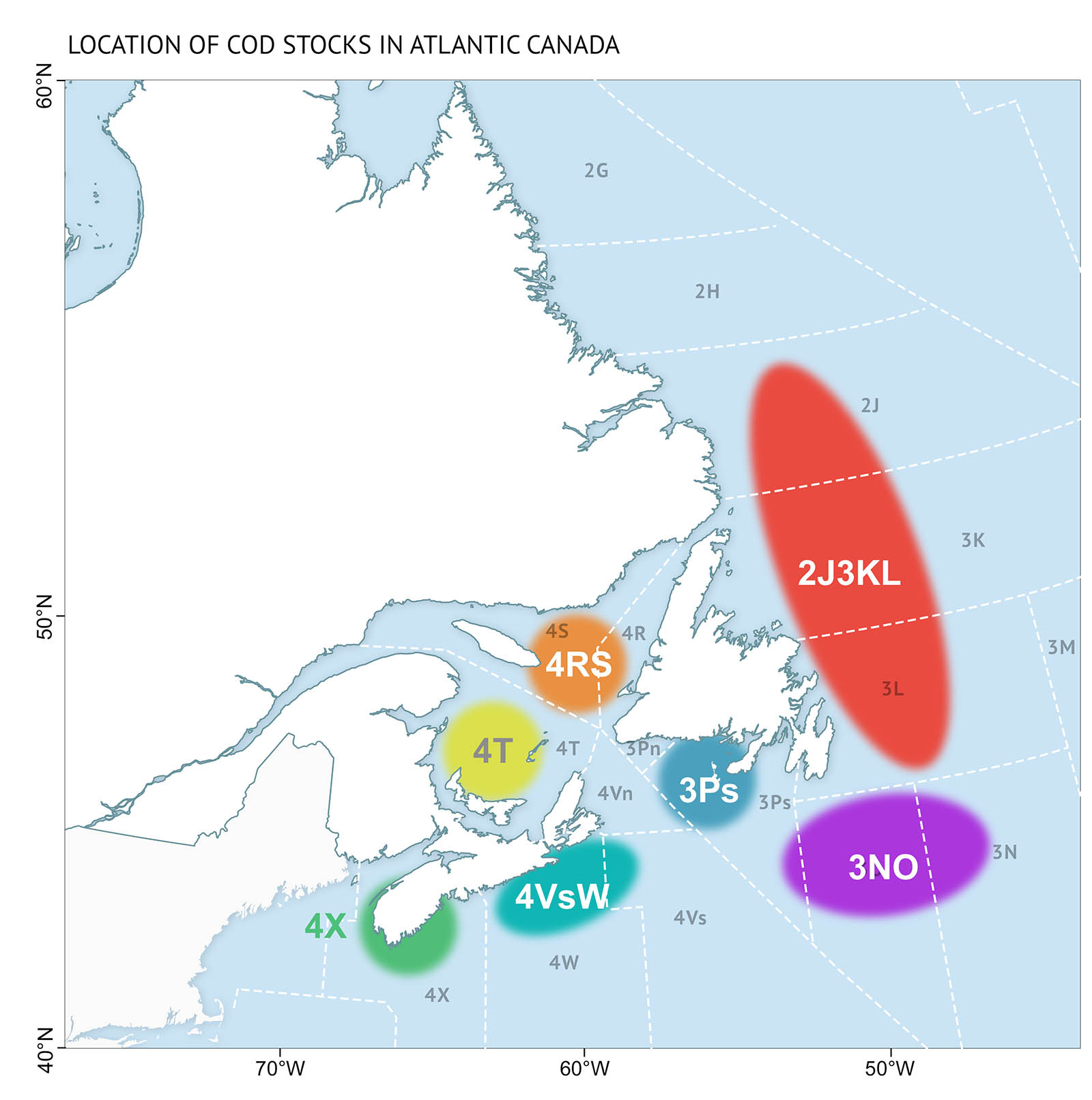
Figure 18: Location of cod stocks in Atlantic Canada. Of the seven Atlantic cod stocks in the Canadian Atlantic, some appear to be recovering slowly, whereas others remain at low levels or continue to decline. The importance of overfishing, environmental conditions, capelin availability, and predation by seals is different between bioregions.

Figure 19: The abundance of harp seals and grey seals in Atlantic Canada. They have been increasing in abundance to levels not seen in 50 years.
Gulf of St. Lawrence
There are two main scientific research surveys carried out annually in different areas of the Gulf of St. Lawrence bioregion. The bioregion is therefore assessed as two sub-regions: the northern Gulf (4R, 4S) and the southern Gulf (4T). An annual September survey was started in the southern Gulf In in 1971. Then in 1990, an August survey was started for the Estuary and northern Gulf. These surveys use bottom trawls to gather information about the species present and their abundance.
Bottom trawls are not ideal for assessing pelagic fish species, since they live in open water. Therefore targeted surveys are carried out for some pelagic stocks such as Atlantic herring. For other species that do not have targeted surveys, the landings of commercial fisheries can be used to better understand the state of those stocks. When using this type of data, scientists have to keep in mind that the amount of effort put into fishing can influence the landings. As a result, they must be cautious when comparing with research survey data.
Status and trends (Gulf of St. Lawrence)
- In the early 1990s, a drastic decline in the demersal fish community, particularly Atlantic cod, occurred across the Gulf bioregion (Figure 20, Figure 21). Overfishing and a colder environment are thought to have played a role in this collapse. This has led to important shifts in the composition of fish communities.
- In the northern Gulf, Greenland halibut, a deep water fish, was the only species to increase during the 1990s. Recently it has been declining. Atlantic cod, which slowly increased in abundance after 2000, declined again in 2017. Importantly, other demersal fish species (redfish and Atlantic halibut) have increased since 2010.
- In the southern Gulf, demersal fish, including Atlantic cod and American plaice, have remained low or continued to decline in recent years despite low fishing activity. Grey seal predation has played a role in limiting recovery of Atlantic cod [See: It’s complicated: seals and Atlantic cod]. Only a few demersal fish species like redfish and Atlantic halibut have increased modestly in recent years.
- Some pelagic species in the southern Gulf, particularly Atlantic herring, began to increase during the 1980s (Figure 22). Combined with the decline of demersal species, this led to a significant shift in the fish community. Recently, Atlantic herring have begun to decline across the Gulf bioregion, possibly as a result of poor environmental conditions (Figure 22, Figure 23).
- Atlantic mackerel, part of a larger east coast population, is at low levels across the bioregion (Figure 23). After recovering somewhat in the 2000s from declines in the 1990s, the stock collapsed in the 2010s due to overfishing. Capelin is an important commercial pelagic species in the northern Gulf. Although there is no capelin survey, commercial fishery landings have decreased recently.
- The abundance of benthic invertebrates also shifted with the collapse of demersal fish populations (Figure 24, Figure 25). However, recent warming and more predation by increasing demersal species like redfish have led to declining populations of benthic invertebrates. Northern shrimp in the northern Gulf, which increased during the 1990s, have decreased since 2005 (Figure 26). Snow crab populations in the north and south tend to cycle up and down, but may be negatively impacted by warming trends.
- American lobster has increased across the bioregion, favoured by warming conditions. This increase, combined with new fisheries in the 1980s, caused a jump in invertebrate landings in the northern Gulf (Figure 24, Figure 25).

Figure 20: Survey biomass for total demersal fish and individual species in the southern Gulf of St. Lawrence.

Figure 21: Survey biomass for total demersal fish and individual species in the northern Gulf of St. Lawrence.
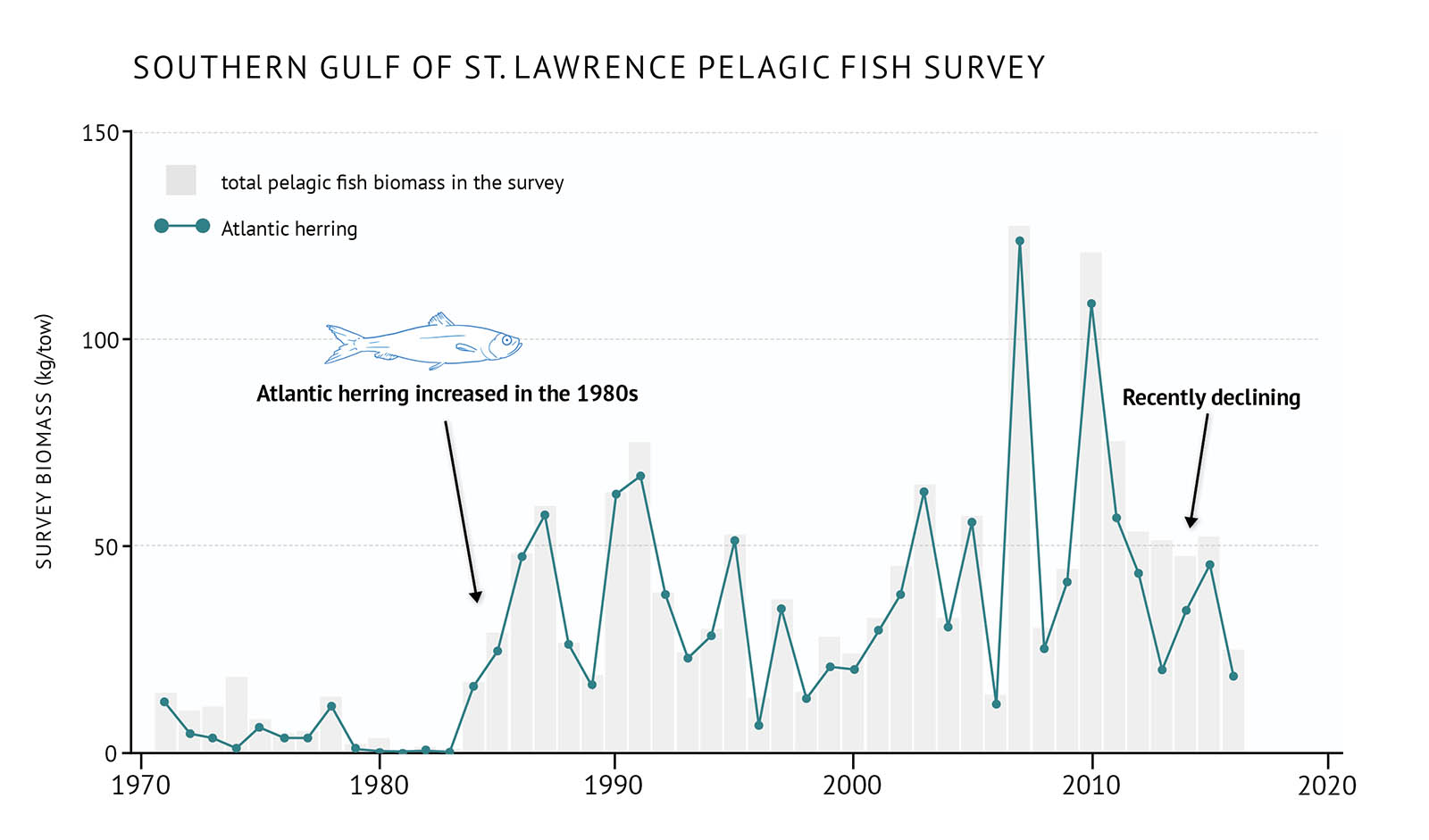
Figure 22: Survey biomass for total pelagic fish and Atlantic herring in the southern Gulf of St. Lawrence.
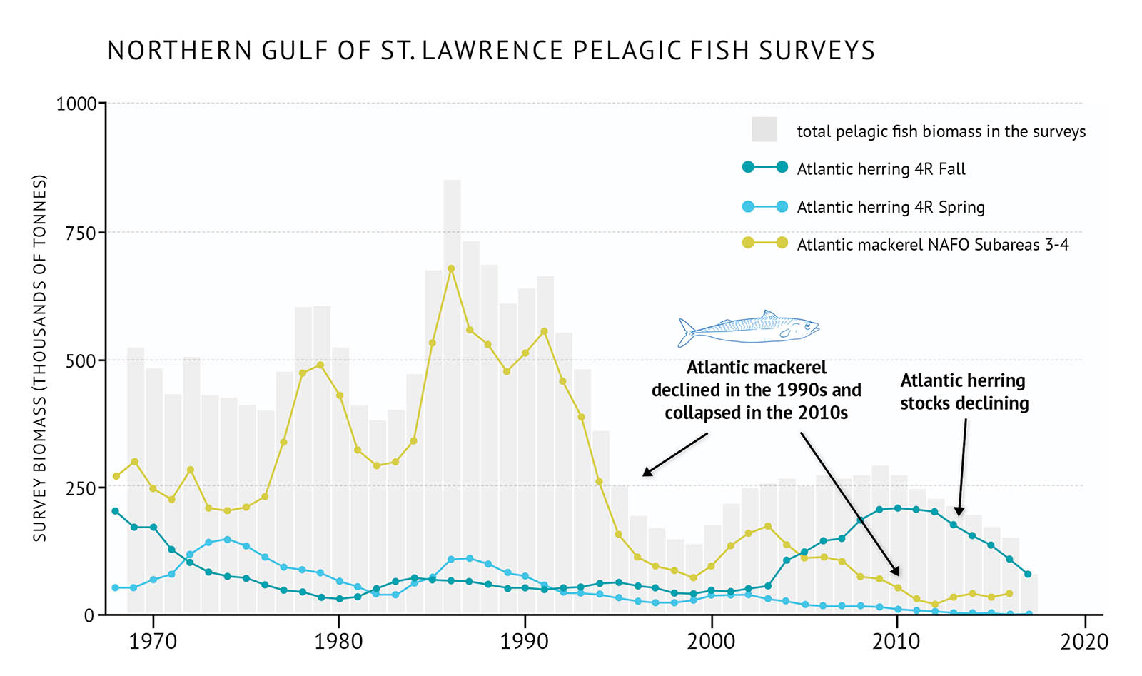
Figure 23: Survey biomass for total pelagic fish and individual species in the northern Gulf of St. Lawrence.

Figure 24: Survey biomass for benthic invertebrates, American lobster and snow crab in the southern Gulf of St. Lawrence.

Figure 25: Commercial fishery landings for benthic invertebrates along with individual species in the northern Gulf of St. Lawrence. New fisheries include green sea urchin, sea cucumber and Arctic surf clam. Other traditional species are Atlantic rock crab, Hyas crab, giant scallop, whelk, common softshell clam, Atlantic jacknife clam and Atlantic surfclam.

Figure 26: Survey biomass for northern shrimp in the northern Gulf of St. Lawrence.
Scotian Shelf
When describing fish and invertebrate communities, the Scotian Shelf is divided into two broad sub-regions: the eastern Scotian Shelf (4W, 4V) and the western Scotian Shelf and the Bay of Fundy (4X). Research vessel surveys use bottom trawls to assess the fish and invertebrate communities in this bioregion, although commercial fishery landings are also used to add to the available data.
Status and trends (Scotian Shelf)
- A dramatic change in the eastern Scotian Shelf ecosystem occurred during the late 1980s and early 1990s. This resulted from major declines in demersal fish following years of high fishing pressure and the onset of cooling conditions (Figure 27, Figure 28). Atlantic cod stocks collapsed, while redfish, haddock, white hake, pollock, silver hake, and thorny skate all declined dramatically.
- In 4X, the declines were less severe and total demersal fish biomass shows no long-term trend in this region.
- There were also drastic changes in pelagic fish species. Atlantic herring, which was an important fishery on the western Scotian Shelf, collapsed during the late 1980s and early 1990s and continues to decline (Figure 29).
- In contrast, benthic invertebrates such as northern shrimp and snow crab were favoured by the cooler conditions in the early 1990s. Commercial fishery landings have continually increased since the 1970s (Figure 30).
- Generally, demersal fish biomass has remained low but variable in the east, and there has been no recovery for Atlantic cod. Recently, the biomass for some demersal species such as 4X haddock and Scotian Shelf silver hake have increased, while the biomass of 4X redfish and Atlantic halibut on the Scotian Shelf are at the highest levels observed.
- Recent warming waters have led to declines in species like northern shrimp and snow crab, which prefer cooler waters. American lobster, which prefers warmer temperatures, is rapidly increasing across the Scotian Shelf and expanding its distribution further east (4W) and into deeper water (Figure 30).
- Recent warming has also brought new species along the Scotian Shelf. While some of these “exotic” species are only occasionally captured during annual surveys, some appear to be here to stay [See: Novel warm-water species].
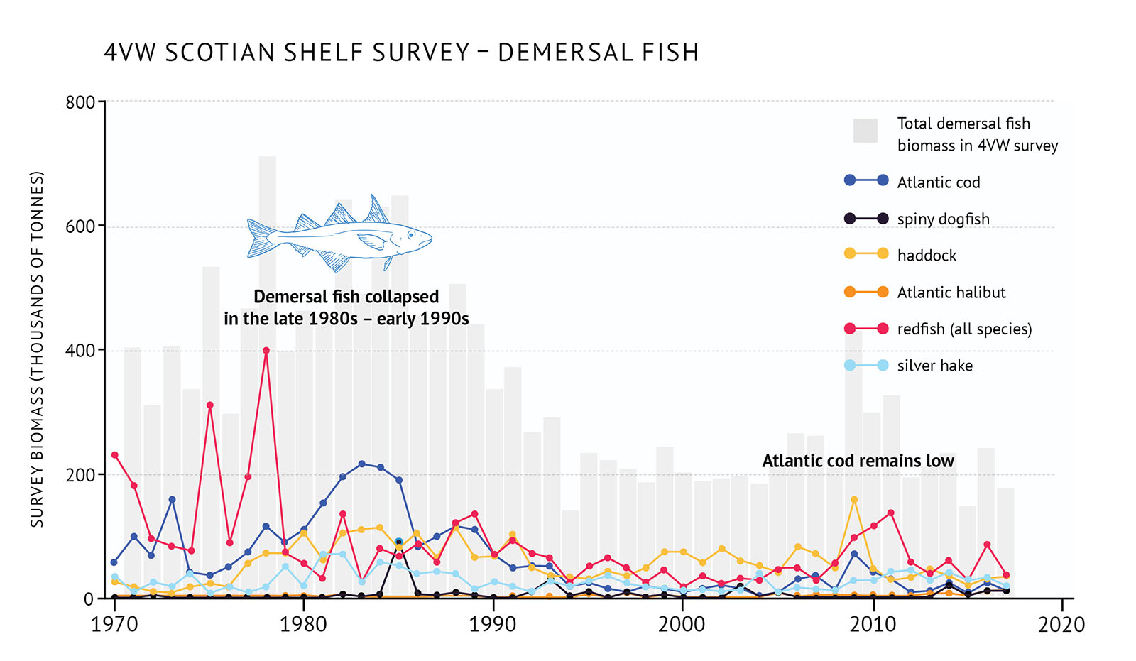
Figure 27: 4VW (eastern Scotian Shelf) survey biomass for total demersal fish and individual species.

Figure 28: 4X (western Scotian Shelf and Bay of Fundy) survey biomass for total demersal fish and individual species.
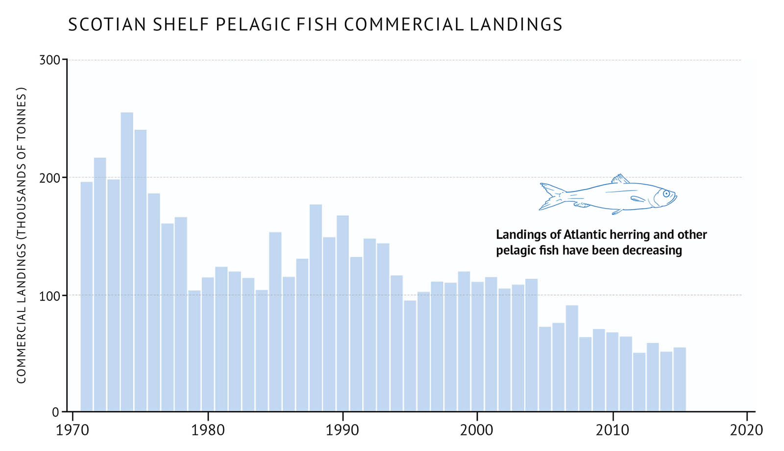
Figure 29: Scotian Shelf commercial landings for pelagic fish.

Figure 30: Scotian Shelf commercial landings for benthic invertebrate species and survey biomass for individual benthic invertebrate species. Commercial landings show a long-term increasing trend. Data collection by research survey began in 1999.
Novel warm-water species
Surveys to monitor environmental conditions and fish populations off the Atlantic coast in recent years have yielded some surprises: an increasing number of warm-water fish species, some of which had been regularly caught further south on Georges Bank are now being more frequently observed on the Scotian Shelf.
The average bottom temperature of the Scotian Shelf and Bay of Fundy waters is 6.8℃ during the summer. This varies from year to year, with the warmest temperatures experienced in the last six years. Bottom trawl catches from the annual summer survey have yielded different species depending on the temperature (Figure 31). Some species, like the barndoor skate, are now regularly caught.
During the past five years, however, the number of exotic warm-water species captured has increased. So has the frequency at which they are captured. Catches of American John Dory, armored sea robin, spotted tinselfish, and deep-bodied boarfish are much more common (Figure 32). Some, like the blackbelly rosefish appear to be here to stay. They are captured every year on the Scotian Shelf and their distribution range is expanding as the ocean bottom warms.
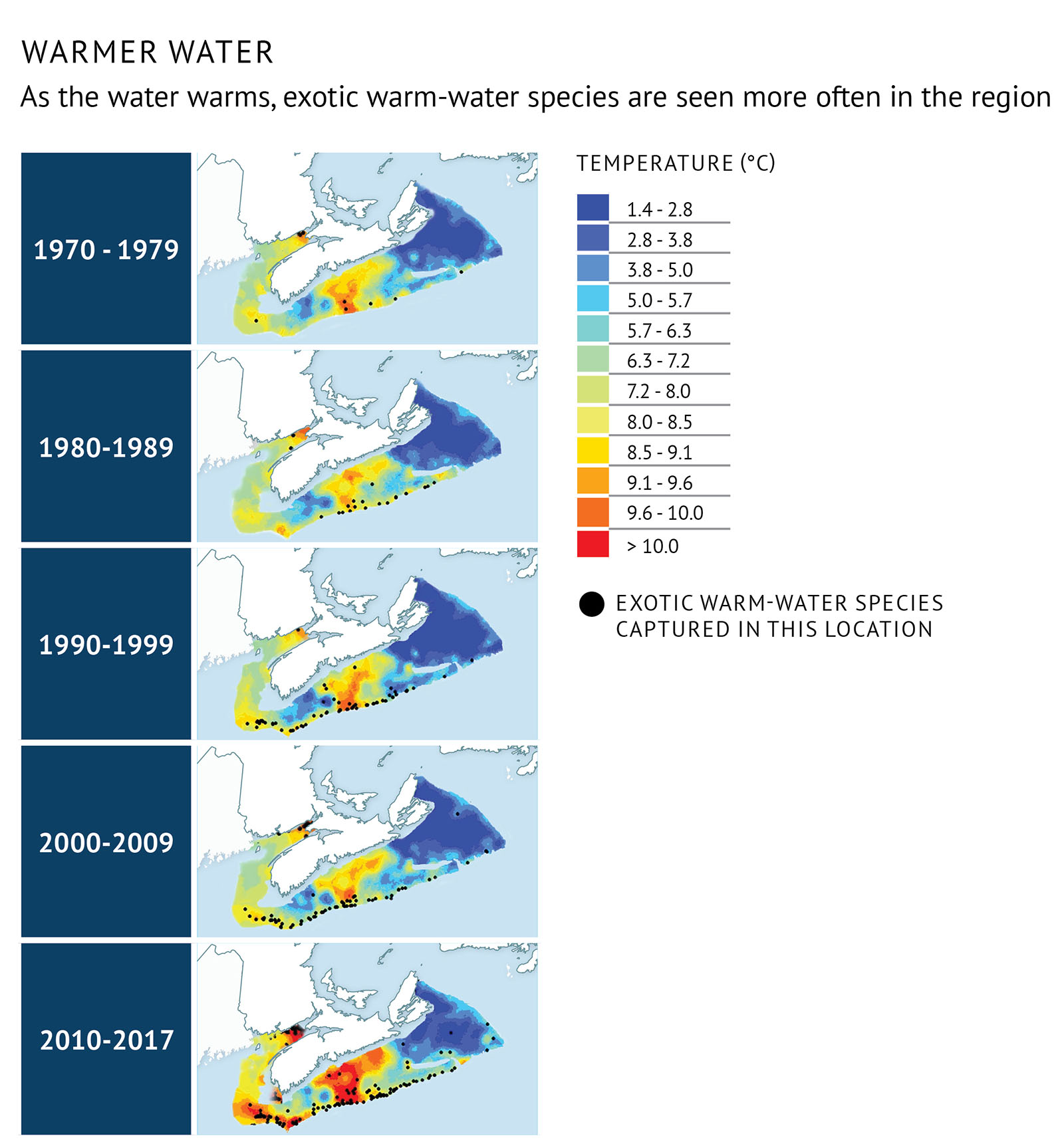
Figure 31: Distribution by decade of captures of warm-water fish species overlain on the average temperature for each time period. Black dots represent a fishing set in which at least one warm-water fish species was present. Recently, the number and frequency of warm-water species captures has increased.
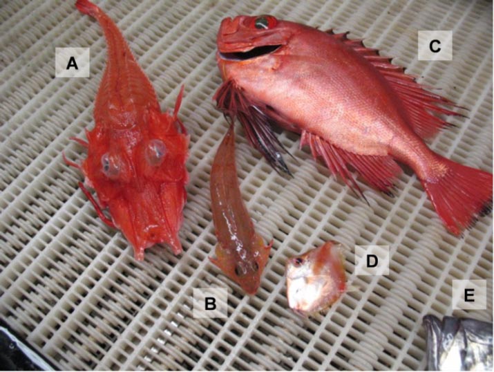
Figure 32: Varieties of “exotic” fishes captured on the Scotian Shelf: (A) armored searobin (Peristedion miniatum), (B) spotfin dragonet (Foetorepus agassizii), (C) glasseye snapper (Heteropriacanthus cruentatus), (D) deep-bodied boarfish (Antigonia capros), (E) American John Dory (Zenopsis ocellata) (partial). (Photo: W. Joyce, DFO)
Newfoundland and Labrador Shelves
The Newfoundland and Labrador Shelves bioregion can be considered as four large functional ecosystems, three of which have long-term data available: the Newfoundland Shelf (2J3K), the Grand Bank (3LNO), and southern Newfoundland (3Ps). Fish and invertebrate stocks are monitored by research trawl surveys which are carried out in spring and fall of each year. The spring survey covers the area from southern Newfoundland (3P) to the Grand Bank (3LNO). The fall survey covers the Newfoundland and Labrador Shelves from 2H to 3NO. The type of trawl gear used in the surveys changed in fall of 1995, so the data are adjusted to make comparisons possible.
As bottom trawls do not give a complete picture for pelagic fish, targeted surveys are sometimes carried out. For example, capelin in 3L has been assessed using acoustic survey methods.
Status and trends (Newfoundland and Labrador Shelves)
- High fishing pressure during the 1960s and 1970s, followed by unfavourable environmental conditions, led to an abrupt shift in community structure in the late 1980s and early 1990s. This change was more dramatic and earlier in the north (2J3K), and somewhat less severe in the south (3LNO) (Figure 33, Figure 34).
- Commercial and non-commercial species of both demersal and pelagic fish declined sharply in the late 1980s. This included the eventual collapse of the northern Atlantic cod stock [See: It’s complicated: seals and Atlantic cod]. Capelin, a key pelagic species, collapsed in 1991 and has yet to rebuild to former levels (Figure 35).
- Populations of benthic invertebrates, such as northern shrimp and snow crab, increased in the late 1980s-early 1990s (Figure 36, Figure 37). This was the result of cold environmental conditions, combined with reduced predation pressure from demersal fish.
- In the late 1990s and early 2000s, little change occurred in the abundance of demersal and pelagic fish, while benthic invertebrates remained high. Northern shrimp and snow crab fisheries became dominant in this region.
- In the mid-2000s, warmer environmental conditions, together with modest increases in capelin, led to an increase in demersal fish and a decline in benthic invertebrates. Overall demersal and pelagic fish biomass is still well below their pre-collapse levels. Total biomass of demersal and pelagic fish in these ecosystems have been showing signs of low productivity since the mid-2010s and, in some cases, declines.
- Warmer water species like silver hake are becoming more dominant in some areas (Figure 38). This may indicate the types of changes that will be seen with climate change.

Figure 33: Fall survey biomass of demersal fish species in 2J3K on the Newfoundland and Labrador Shelves along with individual demersal species biomass.
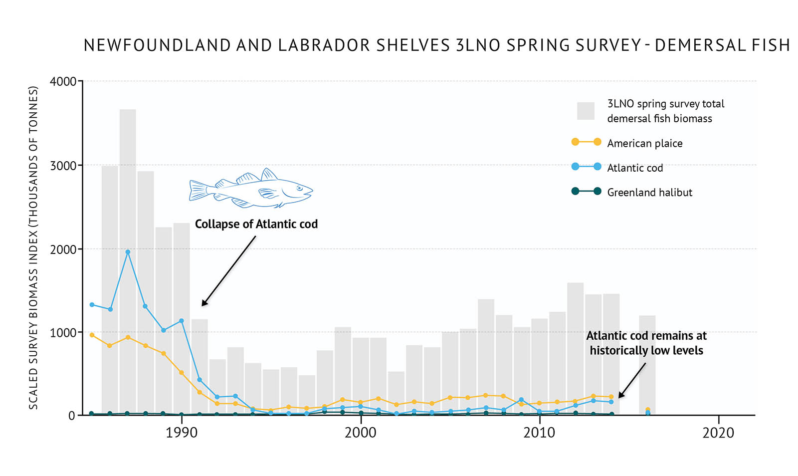
Figure 34: Spring survey biomass of demersal fish species in 3LNO on the Newfoundland and Labrador Shelves along with individual demersal species biomass.

Figure 35: Capelin biomass from the spring acoustic survey in 3L on the Newfoundland and Labrador Shelves.

Figure 36: The total fall survey biomass of benthic invertebrate species in 2J3K on the Newfoundland and Labrador Shelves along with individual invertebrate species survey biomass.
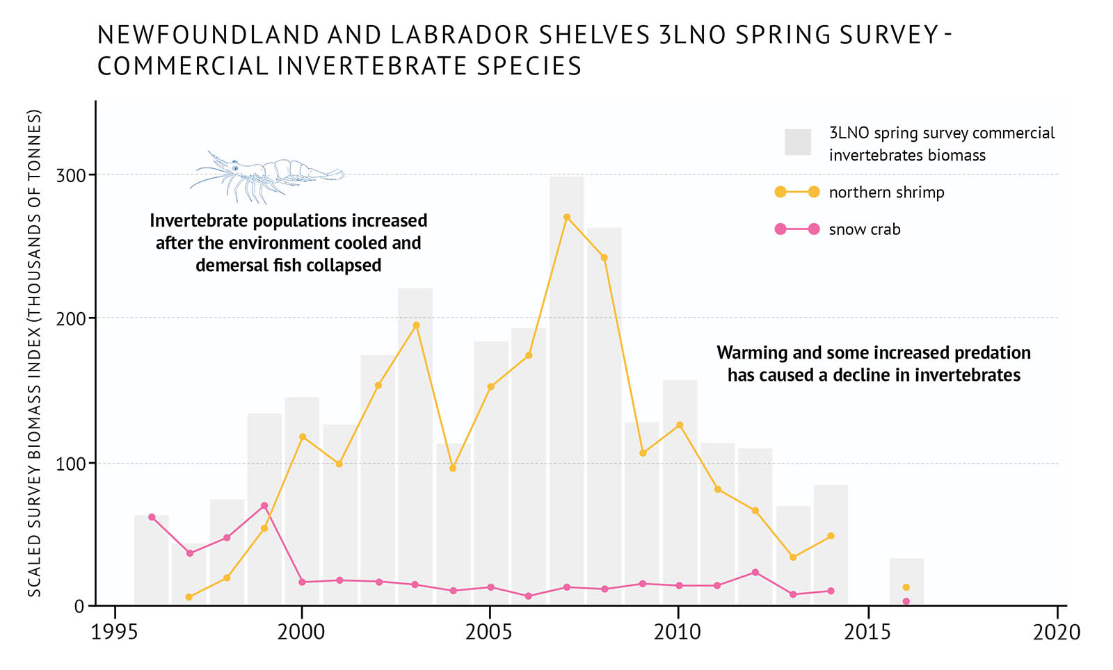
Figure 37: Spring survey biomass of benthic invertebrate species in 3LNO on the Newfoundland and Labrador Shelves along with individual invertebrate species biomass.

Figure 38: Survey biomass of individual demersal fish species in 3Ps on the Newfoundland and Labrador Shelves.
Marine mammals

Figure 39: Current population trends of marine mammals in the Northwest Atlantic. Many are unknown.
There are around 30 species of pinnipeds (seals and walruses) and cetaceans (whales, dolphins, and porpoises) found in the Northwest Atlantic. Many of the cetacean species are summer migrants, including fin whales, humpback whales, minke whales, many species of dolphins, and North Atlantic right whales. These seasonal species are thought to give birth and mate in temperate and tropical waters during winter. They then move north to feed in Canada’s Atlantic waters, mainly on capelin, Atlantic herring, and krill. Some marine mammals in the Atlantic are also found in the Arctic. These include species like the beluga whale, ringed seal, and Atlantic walrus. Migratory species such as harp and hooded seals, spend part of the year in the Arctic, but move southward to give birth (or pup) and feed.
The role of marine mammals in the Atlantic food web varies widely, from fish-eating grey seals to slow-moving, copepod- and fish-eating Northern Atlantic right whales. As many marine mammal species are highly mobile and migratory, their movements can reflect changes in prey or in environmental conditions.
Estimating how many marine mammals live in the Atlantic ecosystem, including their distribution, location, and behaviour can help scientists better understand the marine environment as a whole. Some species have been tagged to monitor their movements and diving behaviours using satellite telemetry. This leads to better understanding of their seasonal distribution and habitat use. For many cetaceans, sightings and occasional reports from boats and observers are the main clues to their locations. The first extensive survey of cetaceans along the Canadian continental shelf was carried out in 2007. Results from a second survey carried out in 2016 will help update these estimates in future reports.
Status and trends
- Our understanding of where marine mammals live across the Atlantic varies significantly among species. Information about numbers and trends in population sizes is not available for many species (Figure 39).
- The decline in sea ice has resulted in increased mortality of harp seals that pup on ice.
- Some species may benefit from less sea ice. For example, less sea ice may reduce the number of endangered blue whales being trapped in heavy ice near shore. During heavy ice years, they can be trapped and pushed onto shore while feeding along the ice edge at the mouth of the Gulf of St. Lawrence and along the southwest coast of Newfoundland during the early spring. In 2014, nine mature blue whales were killed along the southwest coast of Newfoundland. The loss of sea ice extent and northward shift of prey has already led to changes in the distribution of highly mobile pinnipeds and cetaceans. This includes more frequent visits by killer whales to the northern areas of the Atlantic.
- Pupping of grey seals in the Gulf of St. Lawrence has gone from almost completely on pack ice during the early 1990s to virtually all on land as sea ice has declined.
Sea turtles

Figure 40: Seasonal movement of leatherback sea turtles through Canadian waters from 1999 to 2016 from satellite tags. The areas circled in orange represent high use areas (>50% of their time).
The most common sea turtles in Atlantic Canada are leatherback and loggerhead turtles. Both species are migratory, moving between beaches, nearshore coastal waters, and the open ocean in different life stages. Leatherbacks typically occupy Atlantic Canada, one of their most important foraging habitats, from June to December (Figure 40). They inhabit the sun-bathed zone of the ocean, spending most of their time in near-surface waters. This makes them vulnerable to fishing activity as bycatch. Young loggerheads are mainly seen during summer and fall in warm offshore waters. Most loggerhead turtle strandings have occurred in late autumn. The strandings were linked to cooling ambient ocean temperature and the onset of hypothermia.
Sea turtle eggs and hatchlings are subjected to high levels of predation in aquatic and terrestrial environments by a broad range of marine predators, including birds and fish. As such, sea turtles transport nutrients and energy between marine and terrestrial ecosystems. Leatherbacks also contribute to ecosystem balance in some areas by consuming jellyfish, which are a major predator of zooplankton and larval fish.
Leatherback turtles have been observed in high-use foraging areas off Nova Scotia every year since 2002. In-water sampling, application of identification tags, and telemetry studies have all provided insight into the population characteristics, movements, foraging behaviour, and habitat use of leatherback and loggerhead turtles.
Status and trends
- Leatherback turtles and loggerhead turtles are listed as endangered under Canada’s Species at Risk Act.
- Leatherback sightings from marine investigations or by fisheries observers suggest their population in Canadian Atlantic waters is stable.
- The distribution of juvenile loggerhead sea turtles in the Northwest Atlantic is limited by ocean temperature. Most sightings occur during the summer and fall in warm, offshore waters, especially those influenced by the northern edge of the Gulf Stream.
- Seasonal sea turtle population density in Canadian waters remains unknown for all species.
- Between 1996 and 2006, an estimated 9,592 juvenile loggerheads were incidentally captured by the surface long-line fishery.
Seabirds

Figure 41: Average percent change in population size since 1970 of 20 breeding seabirds in eastern Canada for which data is available.
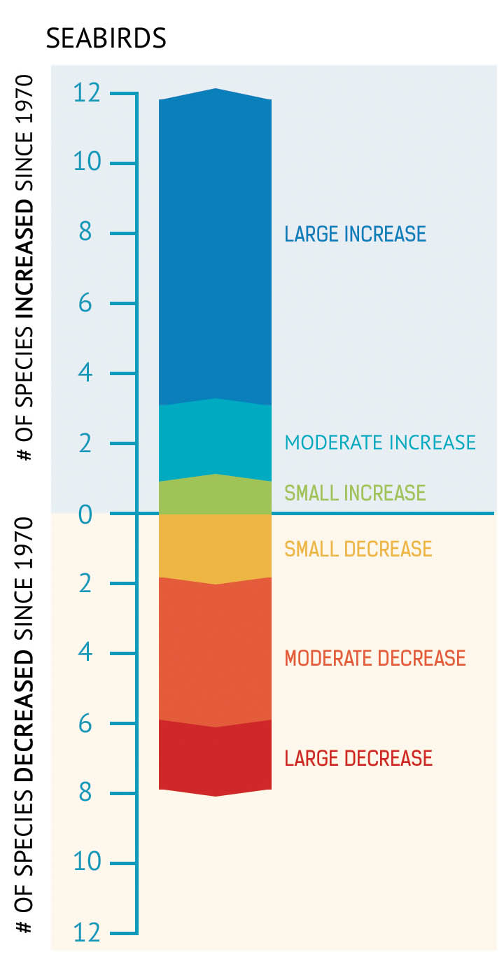
Figure 42: Of 20 seabird species for which data is available, the number of species that have increased or decreased in population since 1970.
More than 20 different species of seabirds breed on the eastern Canadian coastline. An additional 40 species from the Arctic, Europe, and even South America feed in the region. Their total number is estimated in the tens of millions during certain times of the year.
Seabirds are one of the most visible components of the marine landscape. As top predators and excellent samplers of the marine environment, seabirds can be effective indicators of overall ocean health.
Seabird population trends are measured through systematic surveys. This is done by counting all individuals or nests of entire breeding populations at all sites or selected key sites. It is also done through plot surveys that sample a representative portion of the colony. Aerial surveys provide the most cost-effective way of conducting a comprehensive population estimate of ground-nesting seabirds (for example, gulls, terns, and gannets). Ground surveys are required to sample burrow or crevice-nesting seabirds (like puffins and storm-petrels). Cliff-nesting seabirds (such as alcids and, kittiwakes) are best counted by boat.
Status and trends
- Systematic monitoring of the major seabird colonies since the 1970s shows that, overall, the breeding population of seabirds has increased (Figure 41, Figure 42).
- Populations of the Alcidae family — common murres and Atlantic puffins, for example — have grown significantly because fewer have been caught in gillnets since the cod fish fishery closed in most areas in 1992.
- Populations of Northern gannets have also been growing since restrictions were imposed in the 1970s on the use of pesticides in North America. However, their population has been levelling off in recent years. This has resulted in part because of declines in the abundance and changes in the distribution of high quality prey fish.
- Populations of surface-feeding species, such as herring gulls and black-legged kittiwakes, have decreased since the early 1990s. This is the result of changes in oceanographic conditions that affect the availability of prey fish. It is also the result of fewer fish being discarded from fishing boats since the cod fish moratorium on certain demersal fish species, particularly cod, throughout most of eastern Canada.
- A recent assessment of the conservation outlook for all seabirds showed that most species are of modest conservation concern. However, they continue to be threatened by ongoing commercial fishing activities and oil and gas exploration and production. Fortunately, the practice of illegally discharging oil by ocean-going vessels along the Atlantic coast has declined over the past 15 years. This is indicated through fewer oiled birds found along the beaches of Newfoundland and Nova Scotia.
Aquatic invasive species
Aquatic invasive species (AIS) are considered competitive organisms that establish themselves in a new environment that lacks their natural predators. This favours their rapid growth or reproduction. AIS can threaten aquatic ecosystems by occupying habitats and out-competing native species. AIS introduction and spread can occur naturally by larvae or fragments drifting in water currents. It can also occur through human activities, including commercial shipping, recreational boating, aquaculture and fishing activities, animal and aquarium trades or by intentional introduction. Some species of ascidians (non-native tunicates) and the European green crab are the most prolific and troublesome of the non-indigenous invaders along the Atlantic Canadian coast.
The negative impacts of invasive species on Atlantic Canadian marine ecosystems include declines in abundance and biomass of estuarine fish communities, declines in eelgrass and kelp biomass, and shifts in community structure for some benthic invertebrates. Invasive species can also have negative consequences for commercial fishing and aquaculture industries.
The DFO Atlantic Zone AIS Monitoring Program uses standardized methods to monitor biofouling species. It conducts research related to the impacts and mitigation of AIS in the Atlantic.
Status and trends
- As of 2017, 11 marine AIS are recognized as having various levels of negative impact on Atlantic Canada’s marine ecosystems (DFO Atlantic Zone Monitoring Program).
- Warming Atlantic waters, associated with climate change, may further facilitate the establishment and subsequent impacts of AIS on Atlantic marine communities.
Everything is connected
The Atlantic Ocean ecosystems are a complex ecological network. It weaves biological components with the physical and chemical characteristics of the environment. This interconnected ocean network requires careful study using ecosystem-based approaches to scientific research and monitoring.
The interconnected relationship between organisms and processes in the Atlantic Ocean ecosystems are changing. The changes are occurring both naturally and through human influences. Real change is occurring in ocean food webs. The types of species, their location, habitat, and diet are shifting at different rates and scales alongside physical changes in the marine environment.
These changes include rising sea-surface temperatures, ocean acidity, and hypoxic events. They also include an increase in the biomass of many species such as American lobster and Atlantic halibut, and seals. Warm-water species and aquatic invasive species are moving in, and other species, such as North Atlantic right whales, are changing their distribution.
Canada’s Atlantic Ocean is experiencing a loss in sea ice as well as declines in the abundance of Atlantic cod and herring. Some populations of seabirds like herring gulls and black-legged kittiwakes are declining too. Endangered North Atlantic right whales, blue whales, leatherback and loggerhead turtles are struggling in numbers. Some species are recovering and thriving. These include populations of seabirds such as common murres and Atlantic puffins. Conditions of natural habitats are in flux alongside shifts in phytoplankton blooms and zooplankton community structure. These complex changes are all interconnected. Understanding the influence of climate change, human pressures, and natural variability is essential.
Ongoing monitoring and research of the ocean environment and the organisms that inhabit Atlantic marine ecosystems will continue to help uncover how our marine ecosystems are connected and how they are changing. It will also help to improve management and conservation measures.
- Date modified: