Introduction to stock assessment
Unit 3.1: Outputs

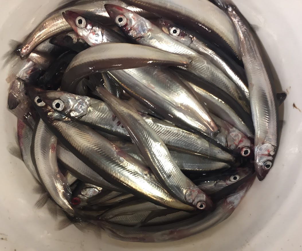
Photo credit: DFO
Models can test management options in a low-cost, low-risk, virtual environment. Scientists are responsible for communicating risk to managers by providing advice in a way that conveys the uncertainty associated with taking different management actions.
Here are some common examples of how stock assessment outputs may be communicated:
Sensitivity analysis
Sensitivity analyses allows scientists to explore the impacts of uncertainty and assumptions by testing different scenarios (for example, random variation in recruitment or different environmental factors affecting natural mortality). They are sometimes included alongside science advice for context.
Decision tables
Decision tables are often used as a simple way to present advice regarding the potential consequences and trade-offs of making different decisions. For example, they can describe the probability that a stock will be above or below a reference point, or project yield at different levels of fishing.
Decision table
Video transcript
[background music begins]
[Visual: The words, “Example: Decision Table” appear.]
Narrator: Example: Decision Table
[Visual: The words, “Scientists use decision tables when providing advice about the status of fish stocks at different levels of fishing” appear.]
Narrator: Scientists use decision tables when providing advice about the status of fish stocks at different levels of fishing. Let's look at an example.
| Annual Catch Level (t) | 2013 | 2014 | 2015 | 2016 | 2017 | 2018 |
|---|---|---|---|---|---|---|
| 0 | 0.87 | 0.88 | 0.90 | 0.92 | 0.93 | 0.94 |
| 200 | 0.87 | 0.88 | 0.89 | 0.90 | 0.91 | 0.92 |
| 400 | 0.87 | 0.87 | 0.88 | 0.88 | 0.89 | 0.90 |
| 600 | 0.87 | 0.86 | 0.86 | 0.86 | 0.87 | 0.87 |
| 800 | 0.87 | 0.86 | 0.85 | 0.85 | 0.85 | 0.85 |
| 1000 | 0.87 | 0.85 | 0.83 | 0.83 | 0.82 | 0.81 |
[Visual: A table appears with the title, “Decision Table: Probability of being in the healthy zone”. 7 columns are titled, from left to right: Annual catch Level (t); 2013; 2014; 2015; 2016; 2017; 2018;. The table has 6 rows.]
Narrator: The 1st column of the decision table shows different catch levels in tonnes.
[Visual: The 1st column is highlighted in dark blue.]
Narrator: The rows show the probability of a stock being in the healthy zone at the start of each year at each catch level (note: the probability in 2013 is the same because it is the starting point for all the projections).
[Visual: The 2nd column (2013) is highlighted in dark blue.]
Narrator: If catch is reduced to zero, the probability of the stock being in the healthy zone increases over time.
[Visual: The 1st row (0) is highlighted in dark blue.]
Narrator: At 600 tonnes of annual catch, the probability of the stock being in the healthy zone remains steady.
[Visual: The 4th row (600) is highlighted in dark blue.]
Narrator: If catch increases to 1000 tonnes, the probability of being in the healthy zone decreases over time.
[Visual: The last row (1000) is highlighted in dark blue.]
| Annual Catch Level (t) | 2013 | 2014 | 2015 | 2016 | 2017 | 2018 |
|---|---|---|---|---|---|---|
| 0 | 0.13 | 0.12 | 0.10 | 0.08 | 0.07 | 0.06 |
| 200 | 0.13 | 0.12 | 0.11 | 0.10 | 0.09 | 0.08 |
| 400 | 0.13 | 0.13 | 0.12 | 0.12 | 0.11 | 0.10 |
| 600 | 0.13 | 0.14 | 0.14 | 0.14 | 0.13 | 0.13 |
| 800 | 0.13 | 0.14 | 0.15 | 0.15 | 0.15 | 0.15 |
| 1000 | 0.13 | 0.15 | 0.17 | 0.17 | 0.18 | 0.19 |
Narrator: The decision table can also be reversed to show the probability of a stock falling below the healthy zone.
[Visual: The values in the table are inversed.]
Narrator: At a lower catch level, the probability of a stock falling below the healthy zone decreases over time.
[Visual: The 3rd row (400) is highlighted in dark blue.]
Narrator: At a higher catch level, the probability of a stock falling below the healthy zone increases over time.
[Visual: The 5th row (800) is highlighted in dark blue.]
Narrator: This is a helpful way to consider how risk increases with higher catch level.
[Music ends]
[Visual: Table fades out to black.]
[Visual: The Fisheries and Oceans Canada logo appears.]
[Visual: The Government of Canada logo appears.]
- Date modified: