
User guide: Widgets
Widgets are used in the Canada Marine Planning Atlas (the atlas) to provide functions to create and display data. There are 3 ways to display data:
- the Layer List is the main widget for accessing data layers
- some layers from the Layer List have been grouped together thematically under the Data Layer Themes widget
- additional published or proprietary data can be added to the map using the Add Data widget
The widgets used in the atlas are displayed in the toolbar located in the top right corner of your screen.

On this page
- Data Layer Theme
- Legend
- Layer List
- Add Data
- Swipe (compare layers)
- Draw and Measure
- Build Report
- Basemap Gallery
- Layer Sources
- User Guide
- Contact Us
- Zoom In and Out
- Home
- Search
- Next and Previous
Widgets
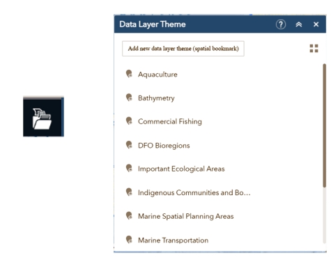
Data Layer Theme
This widget button is a folder with 3 files and it is located in the toolbar in the top right corner of your screen.
It contains a collection of themed layer groupings. When a theme is selected, related layers are turned on and the map zooms to the pre-determined extent of the theme. Themes are automatically unselected when you click on another theme. Also, you can turn any layers on and off under the Layer List widget to override a chosen theme.
You can add a new theme by pressing the Add new data layer theme button. This will create a geospatial bookmark of your current map view, including layers you have turned on.
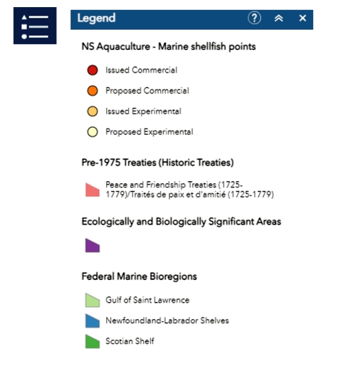
Legend
This widget button has shapes and lines and is located in the toolbar in the top right corner of your screen.
The Legend widget displays labels and symbols for layers in the map. This is a good place to find out which layers are turned on and what they look like. To change the symbology of a layer in the legend, find the layer in the Layer List widget, access its dropdown menu by clicking the button and select Set drawing style. This widget shows which layers have been selected so far. The legend displays labels and symbols for layers in the map and the different coloured symbols that represent each layer feature. It supports:
- dynamic
- tiled
- image
- feature
- Keyhole Markup Language – KML layer types
- Web Map Service (WMS) layers with an associated legend URL
The Legend widget is set to automatically update when the visibility of a layer or sublayer changes. When no operational layers are displayed in the map, the Legend widget is blank.
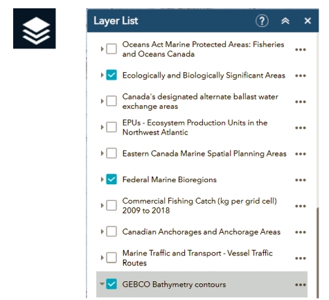
Layer List
The Layer List widget provides a list of layers relevant to MSP that are embedded in, or have been added to, the atlas. Additional published or proprietary data can be added to the map using the Add Data widget. You can turn layers on and off, view sublayers, and do more with layers by clicking the … button.
These actions include:
- Zoom To
- Transparency
- Set visibility range
- Set drawing style
- Supported layer types:
- Feature Layer
- Shapefile, CSV, KML (add data by file)
- OGC WFS
- Supported layer types:
- Move up/down in drawing order
- View in Attribute Table
- Filter in Attribute Table
Note: some data layers have a zoom level that is set by the data layer creator. These layers cannot be viewed until you reach the set zoom level. If the layer is not displayed at the current zoom level, it will be greyed out in the Layer List.
To prevent clutter, data layers do not label any features. Click a feature on the map to view attribute information in the pop-up window.
The Legend widget shows the symbology associated with the layer features.
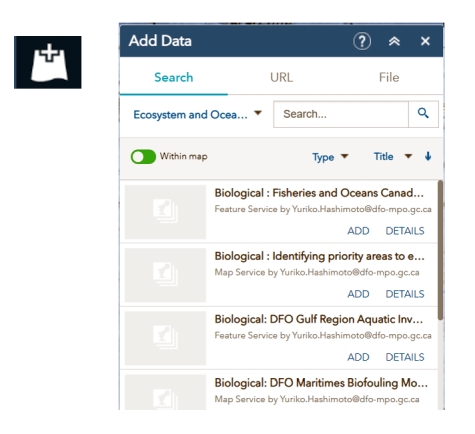
Add Data
The Add Data widget button is a + on top of a piece of paper and is located in the toolbar in the top right corner of your screen.
The Add Data widget gives you options for adding new temporary data layers to the map. Data from a curated list of MSP-relevant datasets, URLs, ArcGIS Online and some file formats can be added from here.
Search:
- On the Search tab, you can search and select from the curated list of MSP datasets. Initially all datasets are shown in the All MSP Data category.
- Clicking on the All MSP Data category reveals a dropdown list of data themes that will show a themed subset of the data when selected.
- You may also be able to search from My Organization and My Content if you are signed in with an ArcOnline or Portal account by choosing those options in the dropdown menu.
URL:
- Add a data layer from a web service
- Compatible services are listed in the dropdown
- URLs to CSV files with spatial coordinates may work
File:
- Add a data layer from a local file
- Compatible file tyles are listed in the ? tool on the File tab
- The files are limited to 1,000 records
- Data layer will be temporarily stored on a DFO server but will be automatically deleted when the browser session is closed
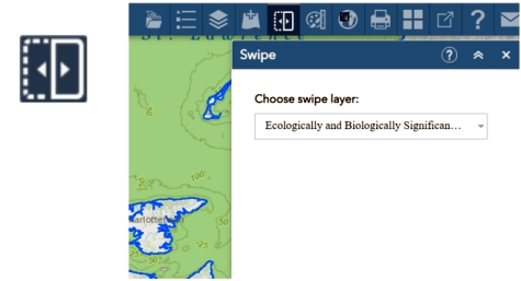
Swipe (compare layers)
The Swipe widget button has an arrow pointing left inside a dotted rectangular outline and an arrow pointing right inside a solid rectangular outline.
This widget enables you to have a quick visual comparison between layers.
Here, one or more layers can be selected to be swiped away by clicking and dragging the swiper in the middle of the screen.
The Swipe widget can be useful to compare thematic layers or to quickly see what's underneath a layer or layers. Note that the widget will only work for layers that are already turned on.
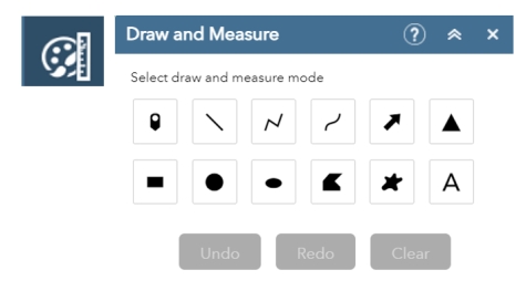
Draw and Measure
The Draw and Measure widget button features paint, a brush and a ruler and is located in the toolbar in the top right corner of your screen.
It allows you to draw simple graphics and text on the map. You may want to draw a graphic or use the text feature for your own report. See the build report tutorial to add line distance or polygon area to the feature as text.
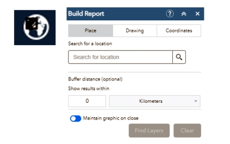
Build Report
This widget button has a circular map in the background with a shaded black box in the foreground and is located in the toolbar in the top right corner of your screen.
The Build Report widget allows users to conduct a spatial search by defining an area of interest. The results of the search can be inspected in the widget or, optionally, exported in a pdf report. The area of interest can be defined through a place name search, by drawing on the map, by uploading a shapefile, or by entering a traverse with coordinate and distance pairs.
Toggling the Maintain Graphic on Close option to off makes it so that any drawings or buffers displayed by the Build Report widget disappear when moving to another widget.
After choosing an area of interest click Find Layers. Here all the layers currently loaded in the atlas will be shown. The number in brackets next to each layer name displays the number of features found in your search area. Those layers currently visible in the atlas will be checked automatically for inclusion in the report.
Clicking Generate Report and Print, will open a new tab in your browser. A report will load with all the features and polygons that we have decided to summarize for the study area.
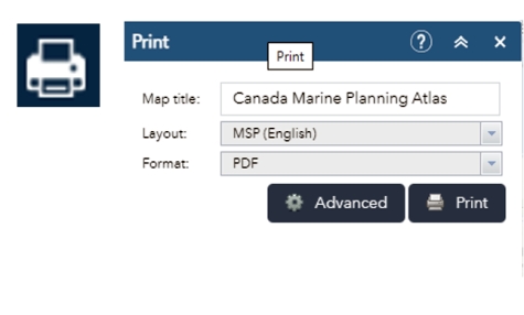
The Print widget button looks like a printer and is located in the toolbar in the top right corner of your screen.
It connects the web app with a printing service to print the current map.
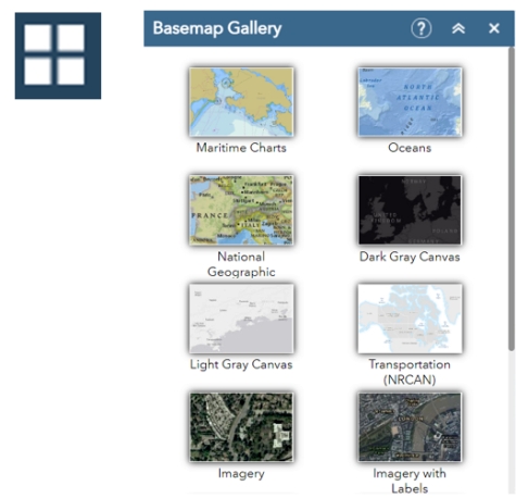
Basemap Gallery
The Basemap Gallery widget button looks like a square window with 4 panes and is located in the toolbar in the top right corner of your screen.
It presents a collection of basemaps that you can select to use as the basemap for your application. The basemap can be user defined or from your organization or portal.
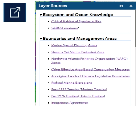
Layer Sources
The Layer Sources widget button is a square with an arrow pointing to the top right corner and is located in the toolbar in the top right corner of your screen.
This widget provides access to view metadata and to download the data from the original source. If you click one of the links, a tab will open in your browser for the relevant external data portal (OpenData Canada or provincial portals).
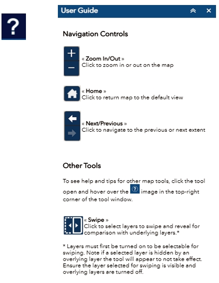
User Guide
The User Guide widget button is a question mark and is located in the toolbar in the top right corner of your screen.
This guide provides a brief overview of some of the features that can be used within the application.
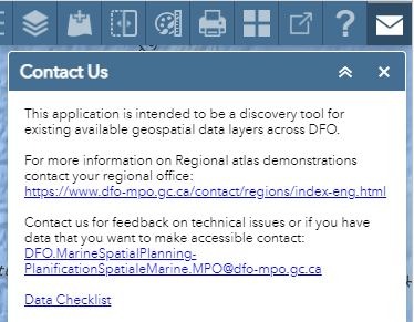
Contact Us
The Contact Us widget button is an envelope and is located in the toolbar in the top right corner of your screen.
Use this widget to find who to contact if you have data that you would like to contribute to the atlas or if you would like to report a technical issue.
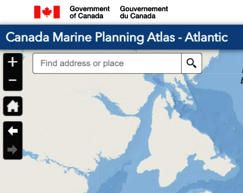
Zoom In and Out
The Zoom In and Out buttons are in the top left corner of your screen.
Click the + to zoom in or the - to zoom out. You can also zoom by using the scroll wheel on your mouse.
Home
Click the Home button in the top left corner of your screen to re-set your session and go back to where you started.
Search
The Search box in the top left corner of your screen allows you to type in and find locations on the map, such as an address or place.
Next and Previous
The Next and Previous arrows below the home button allow you to navigate to the next or previous extent. They let you see where you were looking and working, without losing your spot.
- Date modified: